
Data visualization tools aren’t just “nice-to-have” features. They help you tell the story behind your numbers and play critical roles in the value of your content. Any time you present numbers, you should include a visualization to help your audience understand. With the proper visualization, you can elevate your content into something profoundly valuable.
Sadly, many creators design poor data visualizations due to ignorance or in a quest to make their data “beautiful.” A poorly designed visualization isn’t just a waste of time. It can actually make your information harder to consume. So as a content creator, it’s your job to make your charts and graphs as simple, clean, and clear as possible.
As a content creator, it’s your job to make your charts and graphs as simple, clean, and clear as possible. Share on X10 Data Visualization Mistakes to Avoid
Here, we cover the top data visualization mistakes we see on the web. Avoid these mistakes to keep your charts and graphs clear.
1. Misleading Color Contrast
Color is a persuasive design element. A simple shade change can signify new information. The right colors can even elicit emotional responses. For instance, a red headline and a slightly less red subheading can signify related information. But if the subheading were blue, readers might consider each separate pieces of information.
2. Presenting Too Much Data
It’s tempting to include a lot of information in your visualizations. If one data point is good, five must be great, right? Not really. Humans struggle to compute the meaning of multiple values displayed visually. If you include too much, you’re bound to overwhelm your readers. Some won’t bother to explore the visualization at all.
Look at the following graph. It’s packed with so much data that it’s impossible to explore. No one is going to zoom in and read all of it.
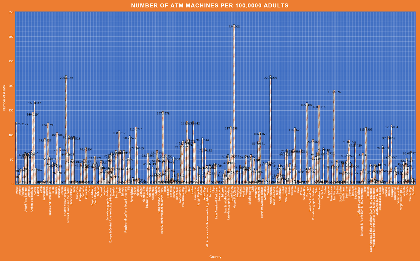
Image source: The Index @ General Assembly
The solution is simple: Instead of putting everything in one graph, split the information and use multiple graphs. Break them up with text that walks the reader through the story of your data.
3. Omitting Your Baselines
Sometimes, data points are so similar that their differences aren’t apparent on a chart or graph. Some creators omit the baseline to make the visualization more appealing. They start the y-axis somewhere above zero to make the differences between data points more apparent.
Unfortunately, this is blatant data manipulation that you should avoid at all costs. Start your y-axis at zero, so the reader understands they are looking at the totality of the data. In the below example, the graph on the left starts at 50, creating a more significant difference between the three groups than is actually there.
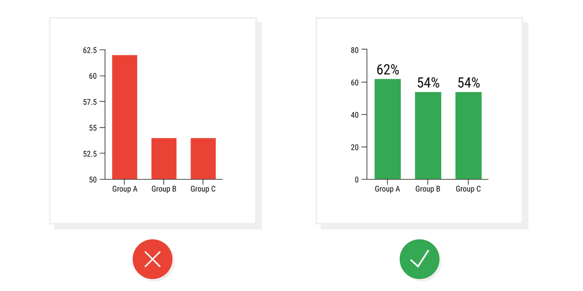
Image source: Ryan McCready
4. Improper Correlations
In some cases, it’s wise to overlay multiple data points on the same visualization to imply a connection between them. For example, you might show the change in temperature over time alongside ice cream sales trends. The implication, in this case, is that ice cream sales and temperature are related. The reader naturally assumes causation.
However, correlating data can be misleading if you don’t imply causation. If you track temperature and cookie sales on the same graph, readers would assume those are related, even though they aren’t. In this case, it’s better to use separate graphs.
5. Using the Wrong Visualization Method
Data visualization methods aren’t one-size-fits-all. They serve different purposes. For instance, line graphs show changes over time, and pie charts compare different parts of a whole. Your readers expect you to use each graph appropriately. If you use the wrong one, you risk confusing your audience.
Consider the charts below. Using two pie charts to compare data sets is problematic because our brains struggle to gauge how much each slice represents as a portion of the total. It’s just the wrong kind of chart for this data. The bar chart is much clearer.
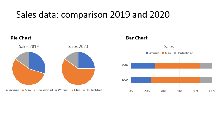
Image source: Towards Data Science
Choosing the right visualization method can sometimes be tricky. Check out our complete guide on choosing the right chart or graph type.
6. Overusing Data Visualizations
As the creators of a data visualization plugin, we love turning data into attractive charts and graphs. But we recognize that that isn’t always necessary. If you need to communicate a single statistic, it’s usually better to forgo the chart and just use text.
Remember: Visualizations are communication tools. You should only use them to make data clearer. If the data is clear without the visualization, skip the chart.
7. Missing Context
On their own, data visualizations only tell part of the story. They usually require some context to help the reader understand the full picture. If you fail to provide this key information, your readers will fail to understand your interpretation of the data. Include plenty of context alongside your visualizations in text, images, and video.
8. Using 3D Charts
3D charts are graphically appealing, but they almost always distort the information they visualize. For example, this revenue graph over emphasizes the orange segment due to the long vertical portion of the slice. Furthermore, it appears larger because our eyes perceive objects as larger if they are closer.
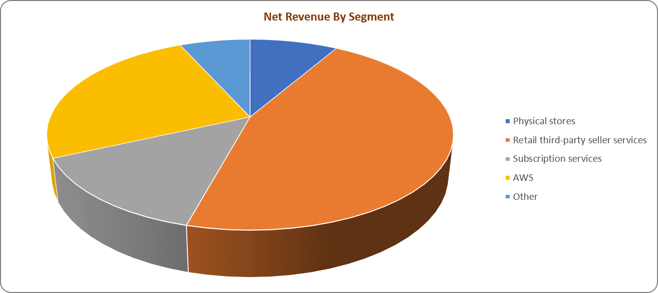
A 2D representation would offer a fairer view of the data in this case. Alternatively, we could depict the same data as a column chart without the unnecessary colors.
9. Maintain Scale Between Graphs
If you’re using multiple graphs to show similar data points, your readers will expect them to be similar. For instance, if every line on a bar graph represents $100, they will assume each line on a similar graph represents $100. If you switch the scales on them, they may not notice and thus draw incorrect conclusions about the information presented.
10. Avoid Unnecessary Design Elements
When creating data visualization, adding design ideas to give your graph or chart some personality or flavor is tempting. You might decide to use borders, background colors, unique fonts, icons, labels, shapes, or other design elements. Some designers even embed images or clip art into their visualizations.
In most cases, these elements simply get in the way of communicating good information to your users. Too many extra details can overcomplicate and clutter the visualization, ultimately overwhelming or confusing your readers.
Strive for simplicity wherever possible. Strip out these unnecessary elements until there’s nothing except the information you want your chart or graph to present. Be generous with whitespace, so there’s no clutter.
Going Forward
In a world with abundant data, using proper data visualizations is key to helping your audience uncover the meaning behind your numbers. But they are only helpful if you use them properly to communicate clear and accurate information. Avoid the data visualization mistakes we explained above to make your information accessible and easy to understand.
If you create a lot of visualizations for reports, check out our tips on making data reporting more effective.
Want a quick and reliable way to turn your data into reports? Check out GFChart. We help web designers elevate their content by creating beautiful visualizations from Gravity Forms data.