
If you want to be a data-driven business that makes objective decisions, simply collecting data isn’t enough. You have to create reports that share your findings with your team, partners, and stakeholders. Data reports are often overlooked in the process, but if you don’t get the right people the right information at the right time, all of that data you collected is meaningless.
Dr Stephanie Evergreen, an expert in visualization and communications (and author of Presenting Data Effectively: Communicating Your Findings for Maximum Impact) says it nicely. “I think the big issue is we often forget how hard it is to be a consumer of data. It’s great that everything has become so data-driven, but I think we have so much of it that we have what I have been calling ‘the burden of knowledge.’”
You can ease this burden with quality data reporting. This article offers a collection of tips to make your data reporting more effective.
If you want to be a data-driven business that makes objective decisions, simply collecting data isn’t enough. You have to create reports that share your findings with your team, partners, and stakeholders. Share on XHow to Make Your Data Reporting Better
What is a data report? A data report is any tool that presents various forms of data to leaders, stakeholders, customers, or your audience. Decision-makers use data reports to inform their next actions at both an operational and strategic level.
You don’t have to be a data scientist to report your data well. Here are some simple and strategic ways to make your reporting more effective.
1. Make Your Reports Accessible
If you want to get the most value out of your reports, it’s essential to make them accessible to the right people in your organization – or everyone. Don’t hide them in email chains or restricted folders. Instead, keep them in a central location where everyone can see them. If the data doesn’t contain anything confidential, consider publishing them on a live page of your site so anyone can read them.
2. Stick to the Metrics That Matter
Like many organizations, you probably collect a lot of data. It’s good to collect everything you can, but that doesn’t mean that all of your data is equally valuable. Your data reporting should only publish the metrics your team has identified as actionable. If you cram your reports with dozens of meaningless data points, your audience will struggle to get through it.
Work with your team to determine which data points deserve a place in your reporting. These should be the metrics that help you make decisions. You can always expand your reports later if you feel more metrics are necessary.
3. Include Context for the Numbers
In many cases, hard data is not enough information to paint a clear picture for your leaders, stakeholders, and audience. In order to help them understand the data (and why it has or hasn’t changed), it’s important to include some context.
For instance, let’s say you have a report with your ecommerce sales figures. If your monthly sales are significantly different from one month to the next, it would be helpful to explain the steps you took that may have affected that number. Armed with this information, you’ll better be able to understand the data.
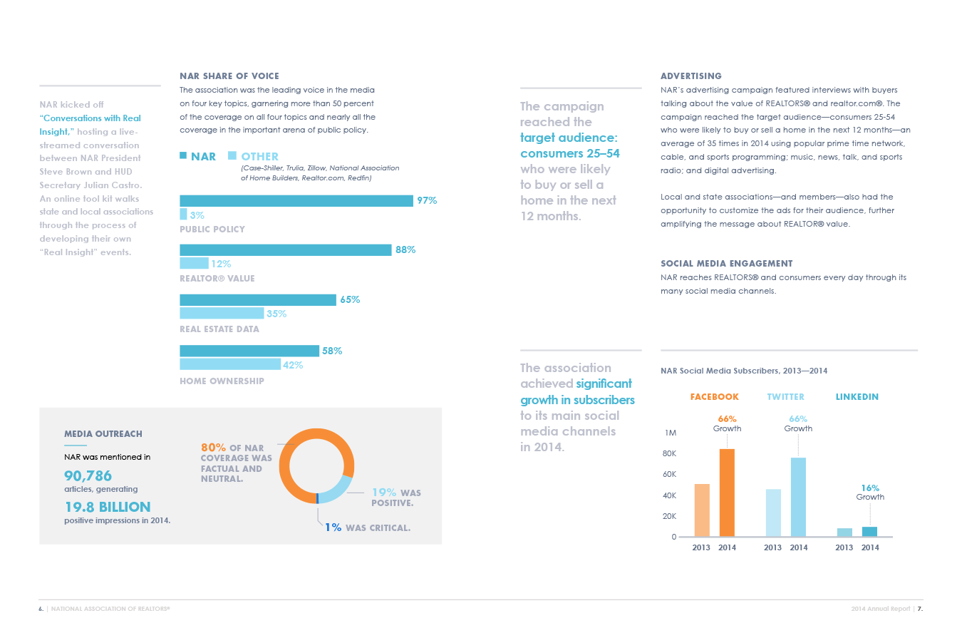
The following report uses paragraph text to add context to the data, helping the reader understand the numbers.
4. Create a Logical Flow Between Datasets
If your report presents multiple metrics, you’ll want to organize them in a way that helps paint a picture for your reader. Lay the foundation of your findings before you get into the details.
For example, if you wanted to report on your ecommerce store’s conversion rate, it would be wise to show the company’s overall conversion rate before breaking that number down by channel or customer segment. Doing this helps your reader understand how the sub-metric relates to its parent.
5. Standardize Your Reports
If you deliver the same report every week or month, it’s meaningful to use the same layout, design, and format for each report. Over time, your audience will become familiar with the report and how to read it. They’ll know exactly where to find the most relevant pieces of information.
6. Establish a Consistent Reporting Schedule
Producing a single report is helpful, but the real value comes from multiple reports. When you look at data at different points, you can see how it changes. The change of data points (how much, how fast, to what degree, etc.) is often more valuable. Regular reporting helps you develop forecasts, make marketing plans, plan your budget, etc.
Establish a consistent reporting schedule for your data reports. It could be weekly, monthly, quarterly, or even yearly, depending on the data you’re tracking. You might want to see your website traffic every week, but you only care about revenue monthly.
7. Acknowledge Your Goals
Whenever you present a data point, it’s helpful to compare it to its goal. Doing this gives your audience (whoever they may be) another way to evaluate your organization’s progress and understand how the data is affected by your work.
Acknowledging your goal is as simple as adding an extra entry to your graph representing the values you hoped to achieve. Use a different color or typeface to make it stand out.
8. Employ Plenty of Data Visualization
Rows and columns of numbers are virtually useless. Readers have a hard time understanding anything from them. If you want your audience to get your data, you must present it visually, using charts and graphs. Doing this is a great way to help your audience identify patterns and take action.
Fortunately, this is easier than you might think. There are business intelligence dashboards that will visualize your data for you. The data you collect through forms can be made into a visual, as well. GFChart helps web designers save time and business owners respond fast by turning your Gravity Forms data into automated reports.
9. Make Your Charts and Graphs Appealing
If your charts are dry and boring, you’ll struggle to maintain your audience’s attention. Use these design tips to make your charts clean and readable:
- Use a clean and uncluttered layout with plenty of whitespaces and generously sized type.
- Put your legend and other reference material in an easy-to-spot place, so your readers view it before deciphering the chart.
- Use left justification and maintain strong alignments to define the columns and rows clearly. Stay consistent!
- De-clutter the layout by removing unnecessary lines and design elements. If you must use lines (perhaps to help users track data across rows), keep them soft and subtle so they don’t demand your readers’ attention.
- Break up the text into short paragraphs and bulleted points so your readers can skim the report to find what they need quickly.
- Make groups of symbols easier to read at a glance by keeping them close together, creating a visual block.
- Use color to draw readers to the most critical points. That said, don’t go overboard, or colors may become distracting.
- Use colors consistently across charts. For example, if yellow indicates a high performer in one chart, use yellow for all high performers across all charts in the report.
- Give each chart/graph in your report a title that explains what it measures. Consider adding a tagline for some extra detail.
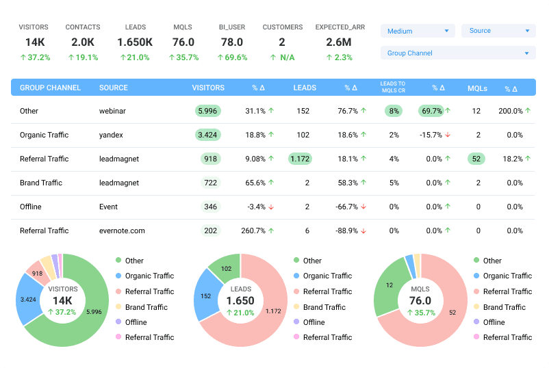
Notice how this report uses font size, colors, and layout to make data easy to understand. It even highlights the crucial metrics with a background color to draw the eye.
10. Format Reports for the Web
For some reason, many organizations are stuck in the past. They format their reports as if they’ll be printed and stored in a folder or bound in a book. Paper-sized documents just aren’t that useful anymore.
Instead, format your data reporting for the web. In fact, publish them on a page on your site. Many of your readers will consume the report on a mobile device, so publish them in a responsive format that conforms to any screen size.
11. Marry Emotion with Data
If you’re trying to use data to make a point, it can be helpful to add some emotion-stirring elements to your report. You can persuade people to change their minds or take action when you appeal to their heads and hearts.
For instance, on a chart that plots the rising carbon levels in the atmosphere, you could humanize the information by including an image of a group of people sweltering in the heat or covering their faces in smog. Doing so would improve the “weight” of the data by grounding it in reality.
Key Takeaway
Whenever you create a report for your data, it’s critical that you consider the reader’s ability to consume and understand the information. Ask yourself how you can make it clear, intuitive, and comprehensive. Take data reporting seriously so you and the other leaders in your organization can make good decisions.