
Visualization is a key part of interpreting and publishing your data. If you want people to read your data and understand the conclusions they should draw from it, you need to display it visually. This is important whether you’re presenting your data to your school, colleagues, leaders, or stakeholders.
In fact, effective data visualization can determine whether your project is successful or a failure. If you put a lot of effort into collecting, analyzing, and modeling your data, but choose the wrong type of chart or graph to display it, then all of your work was pointless.
In this article, we will help you determine the best type of chart for your data set. We’ll cover some important questions to ask yourself and then give you an overview of the main graph/chart types to help you present your data properly.
Effective data visualization can decide whether your project is successful or a failure. Share on X6 Questions to Help You Determine the Right Graph or Chart
Before you start considering the different types of charts and graphs, ask yourself these six questions. The answers you provide will help you understand your data and give you a better idea of the type of charting you need to represent it.
1. What story are you trying to tell?
If you think of your data like a collection of facts, then your charting is the story you tell your audience. Ask yourself: “What kind of story am I trying to tell? How can I use my data to support it?”
Are you trying to tell a story about trends, progress, or changes? Then you need a chart that depicts data over time. Are you trying to explain distribution or relationships? Then you need a chart that compares values against each other.
2. How big is your data set?
The amount of data you need to display will affect the type of graph you choose. Some graphs are not suitable for large data sets, while others require a lot of data. For instance, pie charts struggle to display more than six data points without becoming cluttered, but scatter plots can show hundreds of data points easily.
3. Who is your audience?
It’s important to keep your audience in mind as well. You will want to make sure that the people who view your graph will understand it. If your viewers aren’t familiar or comfortable with charting, for example, it wouldn’t make sense to offer them a complex bubble chart that displays three or four data points. In this case, you would want to offer something simpler to understand, or perhaps use multiple charts to make your argument.
4. What type of data do you have?
Different data types require different charts. Some types of data are incompatible with certain types of charts. If you have continuous data, you need a line chart, area chart, or scatter plot. If you have categorical data, you need a bar graph or pie chart.
5. Do you want to compare values?
Sometimes we need to use a chart to explain how two or more values are related to one another. For example, if you wanted to show ticket sales (first value) over time (second value), we would need a multi-value chart to compare the values to one another, such as a line graph, scatter plot, or bubble chart.
6. Do you want to show the composition of something?
Sometimes you want to compare values of data points that make up a composition. For instance, you might want to compare the number of employees who are vaccinated against COVID-19 versus the number of employees who aren’t. This requires a chart that shows composition, like a pie chart, stacked bar graph, or area chart.
Different Kinds of Graphs and Charts
There are dozens of charts and graphs you can use to display your data, but most of them are niche cases that are rarely practical. Let’s talk about the most popular graphs you can use to chart your data.
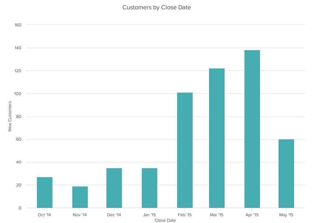
1. Bar graph
A bar chart is used to compare different items. Use it to display both positive and negative values. It can also be used to show a comparison of items over time. However, bar charts are not useful for multiple data points.
Best practices for designing bar charts:
- Use consistent colors throughout the chart.
- Only use accent colors if you intend to highlight something important.
- Use horizontal labels to improve readability.
- Start the y-axis at 0 to accurately reflect the values in your chart.
- You can display the bars horizontally or vertically.
- Label each category clearly, either underneath its bar or in a legend.
- Avoid using too many categories. There should be no more than 10.
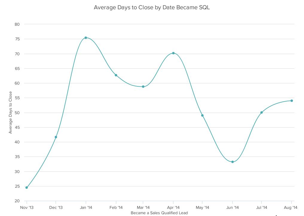
2. Line chart
A line chart shows progress or trends over time. It can include one or multiple categories on the same chart. It should only be used when you have a continuous data set. For instance, you could use a line chart to show revenue by month over the course of a year, but only if you have revenue figures for all twelve months.
Best practices for designing line charts:
- Use solid lines for readability.
- Don’t plot more than four lines, otherwise it becomes visually cluttered.
- Use exact values, not estimations.
- Line charts work better with bigger datasets. If you have a small dataset, opt for a bar graph.
3. Pie chart
A pie chart shows how different categories make up the composition of a dataset. The entire circle represents the whole of something. The individual slices represent pieces of that whole.

Best practices for designing pie charts:
- Make sure the pieces add up to 100%. It’s best used with small datasets.
- Data should be nominal and not ordinal.
- Display the slices according to their proportional size. For instance, a slice that represents 25% should fill one quarter of the pie.
- Color the categories differently so they are distinct.
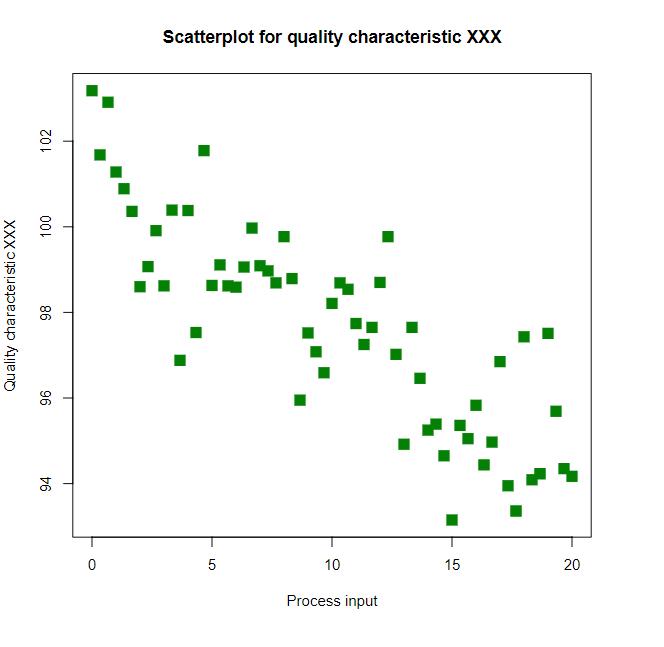
3. Scatter plot
A scatter plot (sometimes called a scattergram) is a chart that shows the relationship between two different variables. It’s useful when you want to show how many different data points are distributed.
Best practices for designing scatter plots:
- Your Y-axis should start at 0 for accuracy.
- Avoid using trend lines, but if you must, don’t use more than two.
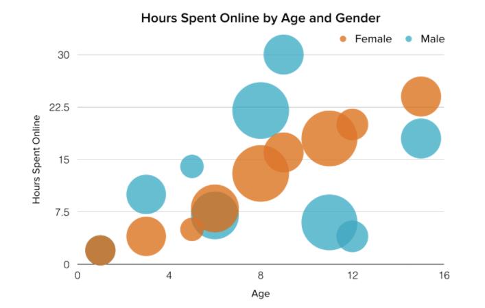
5. Bubble chart
A bubble chart is similar to a scatter plot in that it shows distribution of data points. But a bubble chart lets you add a third variable by changing the size of the point. In the example below, the X-axis represents age, the Y-axis represents hours spent online, and the size of the bubble represents the number of hours.
Best practices for designing bubble charts:
- Only use circles for your bubbles. Shapes that don’t expand uniformly can be confusing.
- Make sure viewers can distinguish the edges of each bubble, especially when similar colors overlap.
- Scale bubbles according to their area.
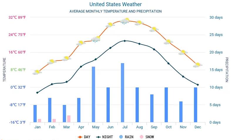
6. Combination charts
A combination chart is simply the use of two or more different charts/graphs on top of one another. These are helpful when you want to compare different variables, but don’t want to serve two separate graphs (perhaps space is at a premium).
Best practices for designing combination charts:
- Use distinct colors so viewers can distinguish between the variables.
- Use the right Y-axis for different values.
- Make sure the relationship between the variables is clear. The graph should relate to the same concept or theme.
Going Forward
Generally speaking, it’s best to use the simplest visualization that it takes to tell your data’s story. Limit yourself to only the data points that make your argument. There’s no value in including unnecessary data points just to make your graphs look “fancy” or “professional.”
Choose simple fonts and colors, use lots of whitespace to avoid clutter, and opt for multiple single-purpose graphs rather than one graph that tries to do everything.
By now you should have a good idea of the type of graph or chart to use for your data. We covered the main types, but there are others for niche cases. Look for the best way to present your data and your viewers won’t have any trouble understanding it.