
A report is only as good as the information it provides. If it does not help the reader, the report will be dismissed as unhelpful. It will probably be ignored, thereby wasting the time and effort of everyone who collected and organized the data.
In this article, we’re going to run through the common reporting mistakes we see regularly. Review your reports and ask yourself if you’re making any of these errors.
A report is only as good as the information it provides. If it does not help the reader, the report will be dismissed as unhelpful. Share on X1. Not reporting at all
This might sound like a silly point, but it needs to be said. Many people collect valuable data, but don’t report it because they don’t know how. Your data isn’t useful if you don’t see. It’s important to report it, even if you don’t have an immediate use for it and you’re the only one who sees it.
2. Not monitoring trends/changes
Absolute values are often authoritative, but they offer very little meaning. The change of data is often far more valuable.
For instance, while it might be helpful to know how many sales a salesman made today, it would be more helpful to know how that compares to previous days. If you notice a change (like a trend downwards), you would know to take action.
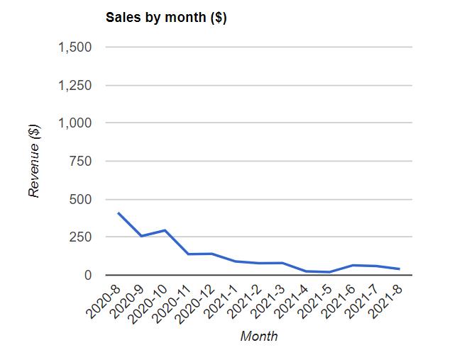
This sales chart shows revenue changes per month. Any data point on its own would be far less useful.
3. Not segmenting data
Segmenting data means dividing it into reasonable cohorts to help you understand it better. Cohort analysis allows you to see trends that are often hidden within piles of data.
For instance, you might look at a data set that indicates COVID-19 deaths are accelerating. But once you break those deaths down into segments of vaccinated vs. unvaccinated, you would see that most deaths are in the unvaccinated column. This data becomes actionable.
4. Not targeting data at the desired audience
While having lots of data is important, most data points aren’t interesting or actionable to the people who view your report. Instead of giving them every detail, focus on the data points that provide relevant information to the person reading it.
For instance, let’s say you want to report on the conversion rate of your lead generation forms. Your C-suite or shareholders only want one simple number. But your marketing team wants to know the conversion rate of each form and conversion opportunity. It’s best to design a unique form for each group.
5. Cherry-picking the results
It’s tempting to focus on the data points that turn out the best. For instance, you might focus on page visits because you have a lot of them, even though ecommerce conversions are what matter the most in your business.
6. Failing to identify discrepancies
Sometimes a weird event creates an outlier in your data set. These outliers affect the reliability of your data and should be corrected. At the very least, it should be acknowledged.
For instance, let’s say your ecommerce store averages five or six sales every day. One day, you’re suddenly flooded with 50 orders. There must be a reason for the spike. In this case, you should investigate the discrepancy and add it to your report for observers to learn.
In some cases, a discrepancy could originate from poor data collection procedures. If a form or other data collection tool isn’t functioning properly, you’ll want to fix it right away.
7. Not combining data sources together
Like most organizations, you probably have data flowing in from several sources. If you don’t consider all of these sources when you generate your reports, you will end up with an incomplete view of your company’s performance.
For example, if you only report on revenue derived from ecommerce sales, while forgetting to include revenue from partnerships, phone sales, affiliate deals, or custom orders – no matter how small – you won’t have a clear picture of true revenue.
8. Forgetting to look at the big picture
If you’re looking at the performance of a small piece of your business, it’s important to consider it within the scope of the rest of your organization. This creates context and gives you and your stakeholders an idea of how this one piece fits into the whole.
For example, let’s say you’re reporting on a marketing campaign. It would help to know how that campaign compared to previous campaigns, or how that campaign affects the company’s overall revenue.
9. Not visualizing your data
Tables of data may be easy, but they don’t help anyone. Our brains have a much easier time understanding visuals. Data just makes more sense to us when presented visually.
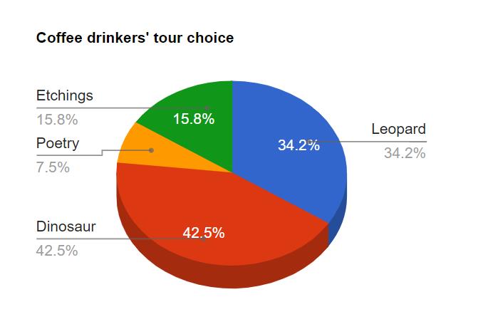
Create graphs and charts that help your readers understand your data’s meaning. Make sure to use the correct type of chart that’s appropriate for the data. This simple pie chart, for example, helps you understand the data at a glance.
10. Not including context
Data is important (especially if it’s displayed visually), but that isn’t the end of the story. Some metrics are hard to understand for some readers, depending on their familiarity with the organization.
Someone who’s familiar with the data needs to add some context to help viewers understand what it means, especially for hard-to-interpret data. They should aim to answer the question, “So what?” It also helps to include some commentary on what you did to produce those results and what you are going to do in the future to improve.
11. Reporting inconsistently (too often or too infrequently)
You can skew the perception of your data by reporting at irregular intervals. If your team, clients, or stakeholders get a report for the month of May, and then a report that only covers the first week of June, they’ll wonder why the data looks so unimpressive.
How often should you report? That depends on the nature of your business and what you are measuring. If you choose a time-based interval, keep the interval uniform between all your reports. You might also choose to report at the end of specific campaigns.
12. Reporting your data manually
If you spend time every day or week compiling a report, you’re wasting your energy. With modern tools, you can integrate your components so they create reports for you on your schedule, or make them available in real time.
For instance, GFChart builds custom reports from Gravity Forms data. When you visit a page with the embedded report, it’s updated to that moment. There’s no manual work involved once the report is built.
13. Including vanity metrics
A vanity metric is a data point that makes you look good, but doesn’t help you understand your own performance and doesn’t give you insight on how to behave in the future. It’s tempting to include these metrics in your reports, especially when they are positive, but they typically offer very little value.
For example, let’s say you’re working on a campaign to bring more people into a brick-and-mortar store, so you track the number of cars in the parking lot. This number may be impressive, but it doesn’t tell you anything about the number of shoppers.
Keep in mind, however, that vanity metrics are relative to the purpose of your report. If you were trying to predict the rate of wear-and-tear on that same parking lot, the number of cars would be relevant, whereas the number of shoppers would be vanity.
14. Failing to catch errors / poor calculations
If your report relies on calculations to present data, it’s absolutely critical that the calculations work properly. Allowing errors to persist means you and your team are using faulty information to make decisions. These mistakes can have serious costs.
Avoid These Mistakes
That’s our list of the top data reporting mistakes. Check your reports for these errors and make any necessary corrections. Quality data with smart reporting is the key to truly understanding your organization’s performance and making smart decisions.