
In a previous post, we offered some questions to help you glean insight from your data. Data on its own, of course, isn’t very helpful. You need to unlock the meaning behind if you hope to create meaningful change in your business.
But insight isn’t the whole story. In order to create change in your business, you need to turn what you learn from your data into actionable steps. That’s the next step. It’s a key part of getting the most value out of your data.
How do you turn data and insight into action? In this article, we’re going to cover three critical strategies that will help you use your data to make real change in your organization.
In order to create change in your business, you need to turn what you learn from your data into actionable steps.
1. Visualize Your Data
Numbers on a spreadsheet or tables in a MySQL database are meaningless to most people. These tools help us organize information, but they don’t help us identify patterns and trends. In order to take action, we need to give our data a visual element that our brains understand.
How do we visualize data sets? With charts and graphs. These simple tools turn incomprehensible data points into useful insight. In many cases, examining a chart of your data will instantly tell you which steps to take next.
Let’s look at a basic line graph. This example plots sales revenue by month for a fictional company.
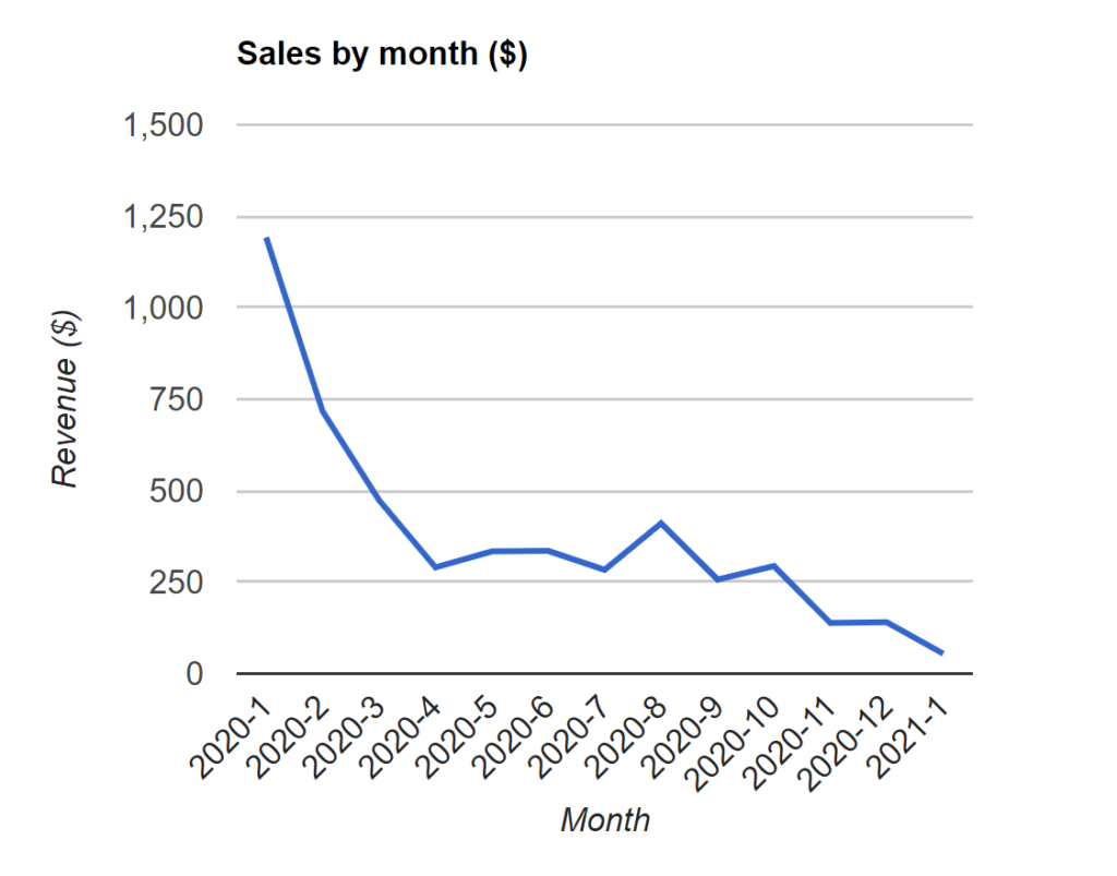
This graph only has 13 data points (12 months in 2020 and one month in 2021). If you were to look at the raw figures, you would probably notice the general decline. It’s no secret that sales in January 2020 were nearly five times higher than a year later.
But the company probably knew that already. They’ve been suffering with reduced sales for a whole year. They probably panic every day about it. Simply knowing “sales are falling” doesn’t help them increase sales.
The visualization, however, gives us more information than a general decline. We can see, for instance, that sales fell precipitously until April. What halted the freefall? This company should examine what happened or what they did in April that stopped the bleeding.
Furthermore, there’s a sudden spike in August we can’t ignore. It’s not enormous, but it’s still double the previous month. What did the team do in August to achieve this? If they used a particular marketing tactic or campaign to stimulate sales, perhaps they should do it again.
Finally, we can see another steep decline in October. Can we pinpoint a cause? How does it relate to the decline from earlier in the year? Answering questions like these will help you understand the causes of your data and thus the actions you can take to change it.
(Need an easy way to make charts and graphs in WordPress? Download GFChart, an add-on for Gravity Forms. It turns your Gravity Forms data into professionally pleasing, insight-generating visualizations.)
2. Develop a Hypothesis
Every insight you glean from your data deserves a hypothesis. This helps you understand whether your insight is accurate. If you can recreate the effect you see in your data, then you will understand its cause. Additionally, you will learn how to influence it. (See how we’re moving from insight to action?)
Returning to our sales example from above, let’s say data analysts at the company believe the sudden decline in sales in the beginning of 2020 is due to lack of stock of a popular product. The product was briefly available in August 2020, which they think explains a short bump in sales.
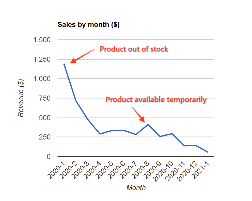
The hypothesis, therefore, is that sales will increase once the product is available for purchase again. (Most organizations would know if a single product devastated their sales like we see in this graph, but we’re using a basic example for the sake of clarity.)
Armed with their hypothesis, the company can now conduct a test. In this case, they would restock the product and watch its sales closely. If they produce a revenue increase similar to the August 2020 bump, they’ll know their hypothesis was correct. If no bump appears, their hypothesis was wrong.
Failed hypotheses aren’t true failures. They still bring you closer to finding the action that creates change, even if they merely eliminate what doesn’t work. Fortunately, in most cases, a failed experiment offers insight beyond the scope of the test. For instance, if stocking the product doesn’t boost revenue, the sales company might learn that their products don’t impact their revenue as much as their services.
Hypotheses don’t require expensive inventory purchases, however. They’re often simple and free to test. You might hypothesize that “we’ll get more Twitter likes if we post cat memes” or “shorter subject lines get more clicks” or “the single column form converts higher.” It depends entirely on your data set and your goals.
A word of warning about experiments: Whenever you test a hypothesis, make sure to control your variables. Changing multiple variables will confuse your results. For instance, our fictional sales company would erode the credibility of their experiment by kicking off a big marketing campaign at the same time they restocked their missing product. They would never be able to tell which initiative caused the change.
3. Identify Your Growth Levers
The final step before you can take action is to identify your growth levers. A growth lever is something you can push to create change.
Growth levers are often confused with key performance indicators (KPIs). A KPI is an important data point to track, but it’s often a lagging metric that only tells you what happened. It doesn’t tell you what to do. For instance, monthly revenue is a KPI, but it only tells you about your previous month. It doesn’t offer any information as to how to increase next month’s revenue.
Let’s say you create a paid search ad that converts well. For every $1 you spend on this ad, it returns $4 in revenue. The conversion rate and ROI of the ad are important metrics to understand, but the growth lever is the number of ads purchased. By increasing the number of ads purchased, you can increase revenue.
The trick, therefore, is to work backwards from your KPIs to find the levers that create change. In some cases, growth levers are obvious (like the paid ad example above) because there’s only one way to make it move. In other cases, you’ll have to comb through your data and run some tests to see what affects your KPI.
We know one lawyer who identified his growth lever by asking himself some probing questions, starting from his primary KPI. The exercise went like this:
- “Where does my revenue come from?” New business.
- “Where does new business come from?” Referrals.
- “Where do I get referrals?” Other lawyers.
- “Where do I meet other lawyers?” Coffee dates.
After this exercise, he realized that his revenue was tied to the number of new lawyers he met for coffee. Boosting his revenue, therefore, required him to invite more lawyers for a 10-minute chat at the coffee shop. That’s a remarkably actionable strategy he can perform over and over.
Going Forward
Now that you understand how to visualize your data, develop hypotheses, and identify your growth levers, you’re on the path to taking action with your data. These techniques will help you create meaningful changes to your organization. Remember to analyze your data, experiment with your hypotheses, and execute your growth levers objectively.