
Like most modern businesses, you probably use data to understand your customers, employees, followers, subscribers, sales, marketing, and other functions.
But data on its own isn’t very helpful. You need to unlock the meaning behind your data in order to create change within your organization. A great data analytics program turns numbers into insight and insight into action.
How do you unlock that meaning? By thinking critically about your data and asking the right questions.
In this article, we’ll cover five important questions you should consider regarding your data. These questions will help you reflect on how you’re using data and how you can get the most value from it.
You need to unlock the meaning behind your data in order to create change within your organization. Share on XCan I trust the accuracy of this data?
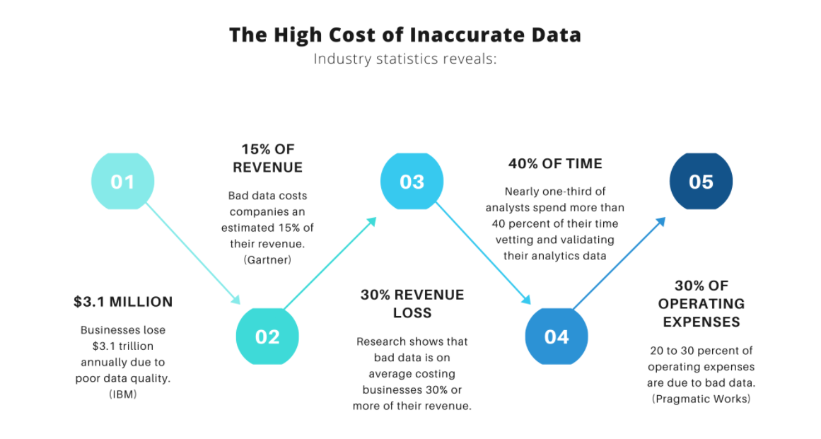
The first question you should ask refers to your data’s reliability. If you can’t trust your numbers, they’re useless. Plus, it’s costly. According to research, inaccurate data costs companies 15% of their revenue and 40% of analysts’ time.
Data inaccuracy is easier to come by than you might think. A misconfigured tracking tool, a poorly designed form, or a negligent or malicious party could ruin the accuracy of your data set.
For instance, one GFChart user requires salespeople to input their weekly sales data into a form. The form’s data is compiled for review by the organization’s leadership. But what if an underperforming salesman chose to nudge his numbers up? That would affect the data’s reliability and impair the leadership’s ability to make good decisions.
Does this mean the sales team should come up with a new system? No, but they should be aware of the potential for inaccuracy.
Your first step, therefore, is to determine whether there’s a vulnerability in your data collection process. Ensure your tools are configured properly and that anyone who supplies your data does so accurately.
Next, consider your data from a high level. Ask yourself if it makes sense intuitively. Are there any data points that aren’t possible or don’t seem likely?
Finally, compare your data to the data of other systems, if possible. If you’re tracking the same data points in multiple ways, the results should line up. Tracking sources won’t produce identical data sets, but your numbers should be close.
Let’s say, for example, that you have a contact form with 150 submissions. But according to Google Analytics, only 75 people have reached your form’s thank you page. Obviously there’s an error somewhere, so it’s important to ask yourself which data point is accurate. (In this case, the form is the accurate source because you have the submissions, but you get the idea.)
Do I have the full picture here?
You may trust the accuracy and authenticity of your data, but that doesn’t mean it’s telling you the full story. You may lack critical data points that give context to the rest of your data set.
For example, let’s say you have a form that asks survey respondents if they would use your product at work. 65% respond “yes,” which is great news. Perhaps there’s a B2B market for your product!
But without additional information, you really don’t know anything at all. What kinds of companies do the respondents work for? How many people work at those organizations? What kind of budgets do they have?
Without those additional data points, the original question doesn’t tell you anything. You can’t draw how much insight from their responses and there’s no action you can take without more direction. You need more data to create context.
Regarding the example above, it would make sense to add more questions to the survey about the types, sizes, and budgets of the companies the respondents work for. Each data point you collect creates a clearer picture.
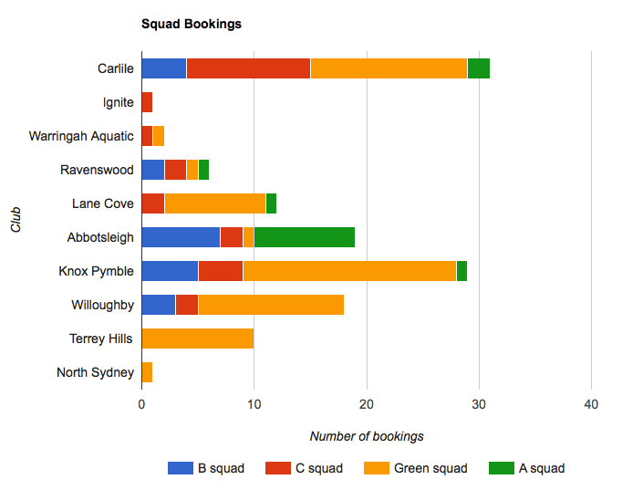
Check out this chart where multiple data points are displayed together. There’s a lot of information in this chart that creates context.
What problem am I trying to solve?
This is an important question to ask because it gives your work clarity and focus. If you aren’t comfortable with data analytics, this question minimizes what you have to worry about.
There’s a tendency for organizations to report on every piece of data they possibly can, but not because they plan to engage in detailed analytics. In some cases, organizations just don’t know what they need, so they end up collecting and evaluating everything.
Data is most valuable when it’s used to make decisions. But not all data points can inform your decision making. There’s no point agonizing over data that doesn’t impact your decisions. Instead, you should focus on data that solves your problems.
For instance, if Twitter isn’t a big part of your marketing (and you don’t intend it to be), scrutinizing the number of retweets you get isn’t helpful. In fact, it’s a big waste of time because it’s a data point that doesn’t solve any of your problems.
It’s smarter to start with your problems. What do you want to improve or achieve? What do you want to be bigger or higher? What should be less or smaller? Then you only have to worry about reviewing data that measures those conditions. It also prevents you from wading through lots of meaningless data.
In many cases, this approach lets you focus on a narrow piece of data. Instead of pouring over your entire marketing data set, for example (which would be overwhelming) you might focus on just the referral sources, or perhaps just your cross-promotions.
That said, it’s never a bad idea to collect lots of data, even those data points that don’t solve your problems. You never know when you might need them. Your problems could change (or your understanding of those problems) and require other data points, so it helps to have a repository of existing data to look back on.
How will I visualize the data?
You may have the world’s most beautiful spreadsheet, but columns and rows rarely help anyone. In order to properly understand your data, you need to present the data visually.
This is especially important if you need to pass your data and insights to other people, like team members, employees, or stakeholders. If these players don’t spend as much time looking at the numbers as you do, their understanding will be even less clear, so you need to present it in an intuitive way that everyone understands.
Instead of studying raw data, it’s smarter to transfer it into a visual format because our brains are better at processing visual information. Charts, graphs, diagrams, and design elements help us understand data and relationships better.
Fortunately, this step is simple with a data visualization tool that integrates with your data collection tool. Google Analytics, for instance, displays your data in a visual format for you, but other data collection services don’t. Most will export your data to a spreadsheet and let you worry about the rest.
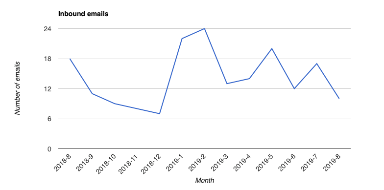
If you need to visualize Gravity Forms data, you need an add-on like GFChart that turns rows and columns into easily digestible charts. Consider this simple chart that tracks inbound emails over time. The trends are immediately apparent.
How does my data change?
A single data point is valuable, but it doesn’t give us much information. It only gives us a value at some point in the past. It doesn’t tell us where that value is going or where it’s been.
Most importantly, a single data point can’t tell you whether any of the work you’re doing has any effect on that value. You could be spending a lot of time and energy on activities that don’t create any real change in your business.
In most cases, a data point is only impactful when we compare it across time. We derive true insight, therefore, from the changes between data points.
For instance, let’s say you have 500 email subscribers. From that number alone, we can’t tell whether your lead generation activities have any effect. We need to dig deeper by examining how that number has changed over time.
Perhaps you examine your subscriber count at different points in the past. You discover you had 479 email subscribers last month and 452 subscribers the month before that. That’s a trend that tells us your lead generation work has some effect. Now you could experiment with other lead-generation activities to see how it impacts that trend. Perhaps new form placement or a new lead magnet will increase the change.
Keep Asking Questions
Obviously this list isn’t exhaustive. To be a great data analyst, you’ll need to think critically and ask unique, penetrating questions whenever you look at your data. But these questions are applicable to any data set. Use them to draw insight that ultimately leads to action.