
GFChart makes it easy to turn data from a Gravity Form into a professional chart. But what if you want to gather data from multiple forms into the same chart? Now you can with our DIY Bar Add-On.
The DIY Bar Add-On is a sophisticated reporting tool that lets you create your own bar charts from any GFChart calculation. Whereas other GFCharts are linked to specific forms and limited to the data of those forms’ entries, the DIY Bar Add-On is a versatile tool that allows you to manually create forms from any other calculation.
This is a powerful tool to display data from different sources in the same place. This way you can quickly create custom charts for specific purposes instead of embedding multiple charts on the same page.
Want to gather data from multiple forms into the same chart? Now you can with our DIY Bar Add-On. Share on XDIY Bar Add-On Capabilities
- Horizontal or vertical bar chart.
- Plotted value is the value from an existing GFChart Calculation.
- Value is calculated upon page display.
- Create the bar label manually (make it whatever you want).
- No maximum number of bars, subject to display and performance limitations.
- Single value per bar.
DIY Bar Use Cases
Before we dive into our tutorial on using the DIY Bar Add-On, we’d like to share some common use cases of this tool. These examples will help you understand the power and flexibility of this add-on.
KPI Dashboards
Like most organizations, you probably have a few key metrics that are significantly more important than the others. You like to keep an eye on these metrics all the time. You can create a KPI dashboard by grouping like metrics on the same graphs. For instance, you could put daily, weekly, and monthly sales on the same graph instead of clogging a page with three separate graphs.
Stakeholder Reports
When you share data with your stakeholders, you obviously don’t want to share every data point you collect. It’s best to keep things simple by only serving the information that supports your arguments. The DIY Bar Add-On allows you to put everything on one graph so your stakeholders get the right information without becoming overwhelmed.
Executive Summaries
Just like you don’t need to tell your stakeholders everything, it’s often unnecessary to send all of your data up the chain. Executives in your organization only want the specific data points they need to make decisions. The DIY Bar Add-On lets you create charts that only contain the information that matters.
Avoiding Repetition
No matter who you are reporting on or who it’s for, it’s always good to keep your information simple and clean. The DIY Bar Add-On is an easy way to create simplicity whenever you create a page or posts by grouping data points onto the same graph.
How to Create a DIY Bar Chart
This tutorial will walk you through the process of creating your professional and interactive DIY Bar chart in WordPress.
For the purposes of this guide, we’re going to assume you already have the Gravity Forms plugin, some forms created, and entries stored. If you’ve never created a Gravity Form before, read their full guide.
Step 1: Install and Activate GFChart
Before you can make your own charts, you’ll need to pick up GFChart. Yes, it requires a small cost, but it’s worth the investment. You’ll find plenty of uses for this plugin beyond this one type of graph. (In fact, many businesses run entirely on Gravity Forms and associated plugins like GFChart.)
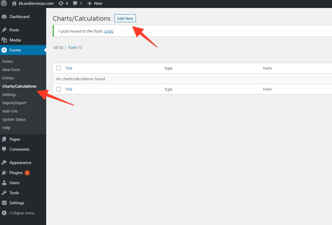
Step 2: Create a New Chart
Your next step is to begin building the chart. Click Forms > Chats/Calculations in your WordPress backend to reach GFChart’s graph builder. Click Add New to get started.
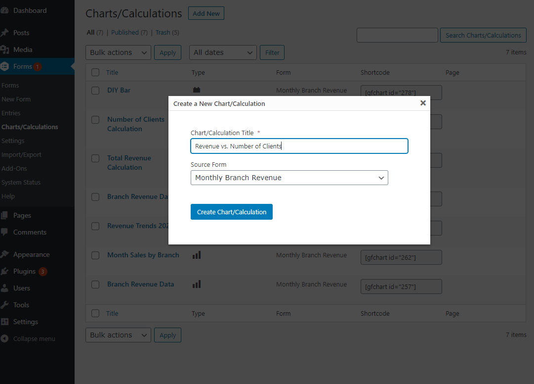
Give your new chart a unique name. Use something that distinguishes it from other charts and calculations you have or may have created. Avoid vague names like “February Calculation” or “Sales Chart.”
Once you’ve chosen a name, select a Gravity Form source. It doesn’t matter which you choose because you’ll be building the chart manually from any other chart/calculation. Then click Create Chart/Calculation.
Step 3: Configure Your Chart/Graph
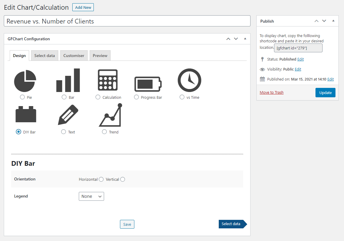
In the chart builder, you’ll see four tabs: Design, Select Data, Customiser, and Preview. We’ll need to go through each tab to build your chart properly.
The Design tab is where you’ll choose the type of chart. In this case, we’ll select the DIY Bar format. Once you select this option, a few more choices will appear below. Choose the orientation of the chart and the position of the legend. Click Select Data when finished.
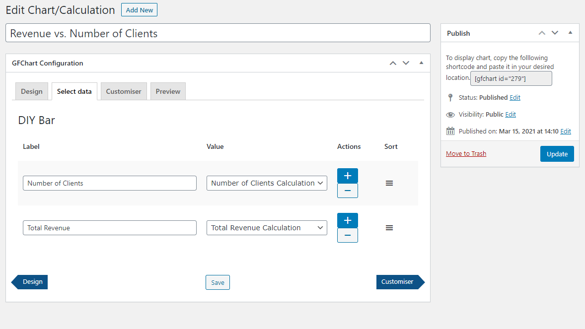
The Select Data tab is where you’ll create the bars of your graph. Each bar requires a label and a value. The label is whatever name you give it. The value is determined by another GFChart.
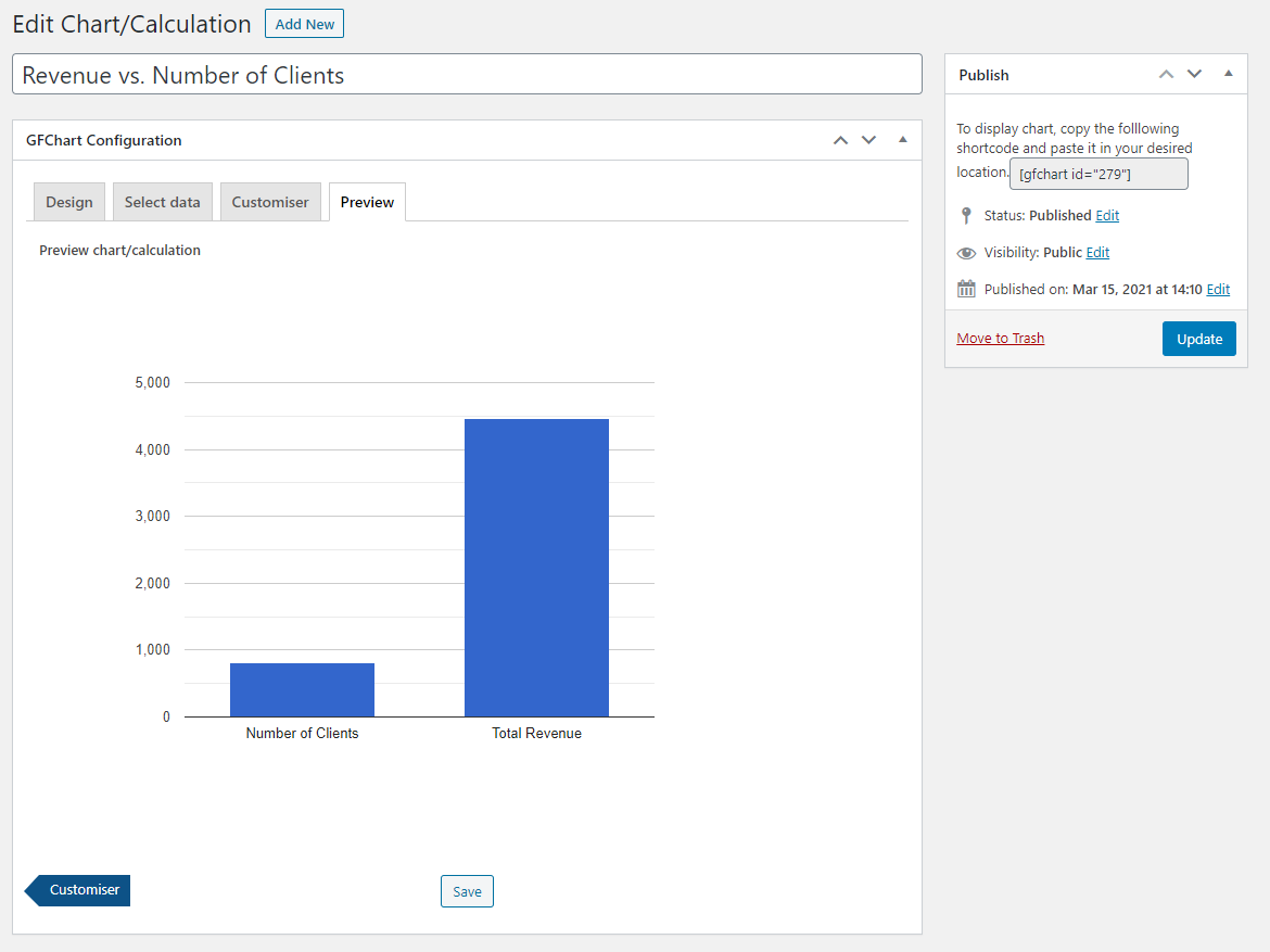
In this example, we’re going to label the first bar “Number of Clients” and select the Number of Clients calculation we already have. We’ll name the second bar “Total Revenue” and select the Total Revenue calculation we made previously.
Use the plus and minu buttons to add and remove bars from the chart. You can also drag them into any order you like. Click the Customiser button when you’re finished.
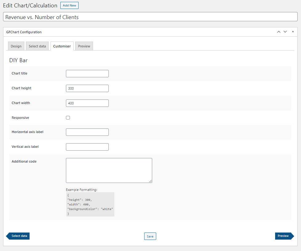
The Customiser tab is your opportunity to configure the chart’s design. Consider the design of your website and how you intend to display the chart. For instance, if you intend to publish the chart in a content area that’s 600 pixels wide, don’t make the chart any wider than that.
If you’re comfortable with CSS, feel free to add your own stylings. Click the Preview button when you’re finished.
The Preview tab is your chance to preview the configuration and appearance of the chart before you publish it to a live page. Make sure your data displays correctly and your chart appears professional as a whole. Once you’re satisfied, click Update.
Step 5: Publish the Chart
Your final step is to publish your new chart to a page or a post on your site. There are two simple ways to do this:
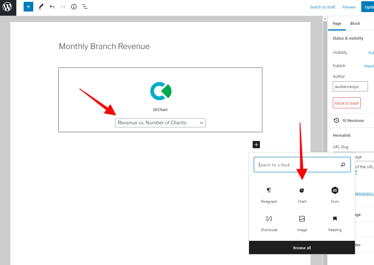
The easiest method is to use a Gutenberg block. Click the plus icon in the Gutenberg editor and choose the Chart block. When the block appears in the editor, use the drop-down selector to choose the chart you just created.
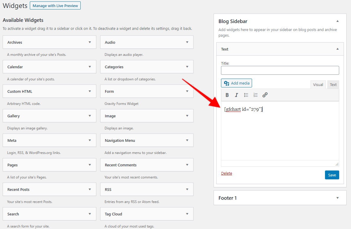
The second is to drop the chart’s shortcode wherever you want it to appear. This is useful if you don’t use the Gutenberg editor (perhaps you prefer the classic editor) or if you want to place it in another type of content editor, like a widget area. You can find the chart’s shortcode from the right side of the chart editor.
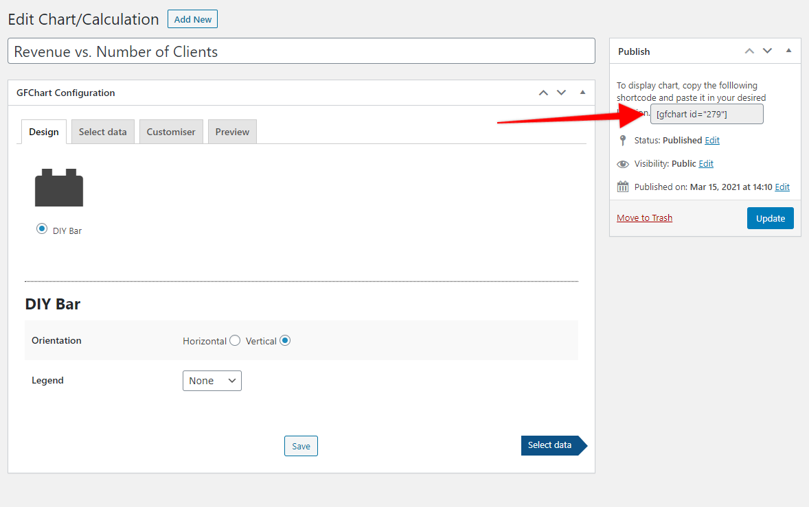
Paste this shortcode wherever you want the chart to appear.
Once you’ve inserted your chart, don’t forget to preview your page or post to make sure the chart appears as you intend. The chart itself will look exactly like its appearance in the chart builder’s preview tab, but it’s always good to examine the final product.
Caution: Be Careful with Your Numbered Axis
A quick word of warning for building charts with data that come from multiple sources:
When you create a DIY Bar Chart, you’ll have two axes: one with categories and one with numbers. It’s important to think carefully about the numbered axis. This could be either the X or Y axis depending on how you set up the graph, but it’s the one with values.
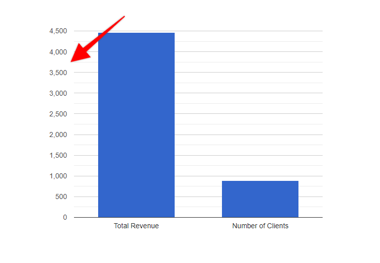
If the values of each category are far apart, it’s possible to skew the chart so far that it becomes meaningless. For example, let’s take the chart from the picture above but change the revenue from $4,469 to $93,349. The number of clients remains the same at 805. Here’s what it would look like.
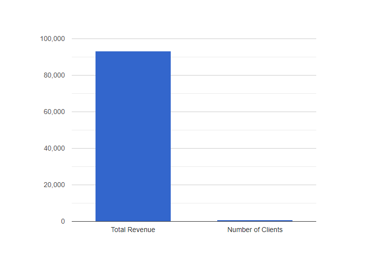
With such a disparity, the chart is basically meaningless. The second bar is so small that it’s nearly impossible to see how it relates to the first bar. The first bar changes the scale of the graph too much.
It’s worth noting, however, that in GFChart, you can hover over each bar to see its true value. But the purpose of a graph is to display data visually. Don’t rely on your readers to investigate hard numbers. They should be able to see the connections between numbers at a glance.
Going Forward
We hope you enjoy this tutorial on creating your own custom bar graphs. This is a powerful add-on that offers significant flexibility and sophistication to your reporting. If you have any questions, please don’t hesitate to ask.