
It’s difficult to extract any real value from raw data. The data may be accurate, but our brains struggle to understand columns and rows. If you want to make your data more actionable, and help your readers understand it, it’s important to format it in a visual way that they can understand at a glance.
The best way to make your data visual on your WordPress website is by using a BI reporting and data visualization WordPress plugin. These tools turn your data from a convoluted mess into insightful information.
In this article, we have listed the best BI reporting and data visualization WordPress plugins. Browse them carefully and choose the one that’s right for your needs.
If you want to make your data more actionable, and help your readers understand it, it's important to format it in a visual way that they can understand at a glance. Share on X1. GFChart
GFChart is a WordPress charts and graphs creator plugin that turns Gravity Forms data into professional visualizations. It’s a simple and easy way to design visually appealing charts from your Gravity Forms data. This means you can create real-time, constantly updating charts based on inputs from other users.
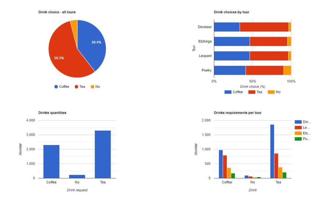
Unlike other plugins, GFCharts are created through a simple user interface. You simply point GFChart at the right Gravity Form, customize your graph, and embed the graph on any page, post, or widget area.
GFChart is ideal for assessments, surveys, registrations, and sales. You can create pie charts (normal, 3D and donut), bar charts (horizontal and vertical), line charts, progress bars, and calculations (count/sum/average/unique values). The best part is that there is no coding required. It also integrates closely with other third-party plugins to help you visualize your data, such as GravityView and GravityPDF.
2. UberChart
UberChart is another WordPress BI and data visualization plugin that allows you to create professional reports without code writing. You gain access to 10 responsive chart types:
- Line charts
- Radar charts
- Area charts
- Polar area charts
- Doughnut charts
- Vertical bar charts
- Horizontal bar charts
- Pie charts
- Scatter graphs
- Bubble charts
To create your charts, you can either upload your data from an external source (such as Open Office, Excel, XML, and Google Spreadsheets) or use the built-in spreadsheet editor. There are lots of options to customize your charts.
3. Visualizer
Visualizer is a popular data visualization WordPress plugin to create interactive charts and graphs on your WordPress pages. You can import data from a CSV, Google Spreadsheets, or from WordPress. There are 15 chart types to choose from. They will automatically sync charts with online files, so your charts and graphs will always be up-to-date for your readers. The Pro version gives you access to a front-end editor and additional chart types.
The downside to Visualizer is that you aren’t able to retrieve data from MySQL databases. So you couldn’t turn form submission data into a chart unless you export the chart to a spreadsheet first.
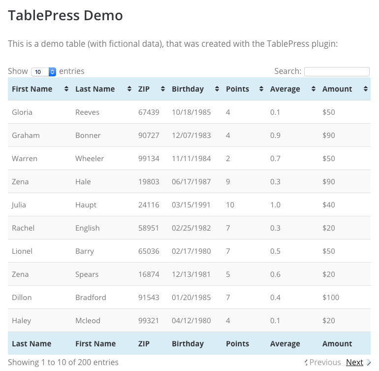
4. Tablepress
Tablepress doesn’t turn your data into an attractive chart, but sometimes that isn’t necessary. This plugin is a simple and intuitive way to display data as a traditional table – columns and rows. You do not need any knowledge of HTML or CSS. You can even add pagination, filtering, and sorting to your tables.
5. wpDataTables
wpDataTables is another popular BI reporting and data visualization WordPress plugin that does not require any coding knowledge. In fact, it’s used by millions. It uses the Google Charts engine, which means it can accept data from a number of sources, such as spreadsheets, CSV data formats, JavaScript Object Notation (JSON), XML, and Serialized PHP arrays.
That said, in order to use those data sources, you’ll need to upgrade to the premium version of the plugin. The free version only lets you add data manually when you create your charts.
6. Inline Google Spreadsheet Viewer
Inline Google Spreadsheet Viewer is a useful plugin for those who like to stick to the Google ecosystem. This plugin turns Google Sheets, CSV files, MySQL databases, and more into attractive charts and graphs on your website. It integrates nicely with your website and updates automatically when the data source changes. So if you (or someone else) adjusts a Google Sheet, the associated charts will update on your web page.
This plugin is free, which is great for businesses on a budget, but the developers do not provide any support beyond what’s included on the WordPress plugin repository.
7. JetElements
If you use Elementor to build your WordPress pages, you might find JetElements useful. This plugin extends Elementor’s functionality by adding 50 new elements, including pie charts, bar charts, progress bars, timelines, and table modules. In addition, you also get 150+ page templates and 60+ home page templates that could enhance your site.

8. WP Business Intelligence
With WP Business Intelligence, you can gain direct access to any MySQL database, including the WordPress database that powers your site or external databases. This data can be displayed in real time on the front end of your site.
WP Business Intelligence gives you access to four chart types with the free version and 11 chart types with the premium version. You can add filtering, sorting, and pagination to your charts to give readers control over each visualization.
This is a high-quality BI reporting and data visualization WordPress plug-in, but it comes with a couple of downsides. First, at $599, the premium version of the plugin is quite expensive. This makes it unobtainable for many businesses. Second, the report export formats are quite limited, so you may need a separate tool to turn your data into distributable reports.
9. POWr Graph
POWr Graph is a WordPress charting plugin that helps you visualize data on the back end or front end of your website. It doesn’t require any coding knowledge and supports multiple chart types. Charts and graphs are added to your pages using shortcodes. Users gain access to interactive controls so they can sort and filter when they view charts.
POWr Graph comes included in the POWr Pack plugin, so you gain access to numerous tools to enhance your website’s content. None of them require any coding experience.
10. Ninja Charts
Ninja Charts is another chart generator with lots of options. You can create numerous charts and graphs in WordPress in just a few steps. Your charting options include:
- Line charts
- Pie charts
- Bar charts
- Bubble charts
- Doughnut charts
- Radar charts
- Polar charts
- Scatter charts
- Area charts
- Combo charts
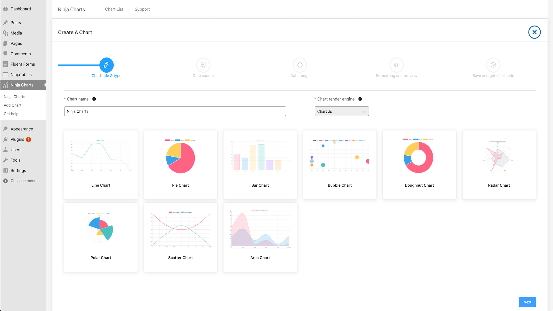
This is a great charting tool to use if you already use Ninja Tables, their plugin that displays data in tables. The downside, however, is that there aren’t many ways to source data, so you may end up inputting it manually. After creating your chart (and customizing its appearance), you can add them to a page or post with a simple shortcode.
Use the Data Visualization WordPress Plugin That’s Right for You
We’ve given you our list of the best BI reporting and data visualization plugins. They are all quality tools, but you should experiment and choose the one that is right for your specific needs.
We designed GFChart to be the best data visualization tool. It helps business owners and content creators save time and business owners respond fast by turning your Gravity Forms data into automated reports. Get started now.