
Creating reports for your team, leadership, stakeholders, or followers can be a pain. Your job is to transfer the meaning behind your data to your audience.
Presenting raw data in tables is almost always unhelpful, so like many content creators, you produce charts and graphs to tell the story of your data. A simple chart is a powerful tool to make data engaging and valuable.
But sometimes, a chart doesn’t tell the whole story. It presents the data effectively but leaves out key details you want your audience to understand. In cases like this, you can bolster the value of your charts and graphs by adding context. This article discusses what context means and how you can add it to your data visualization.
Sometimes a chart doesn't tell the whole story. In these cases, you can bolster the value of your charts and graphs by adding context. Share on XWhat is Context for Charts and Graphs?
Simply put, context is extra information you include alongside your data visualizations that give the reader a more robust and comprehensive understanding of your chart. Context is a powerful way to turn plain data into a narrative.
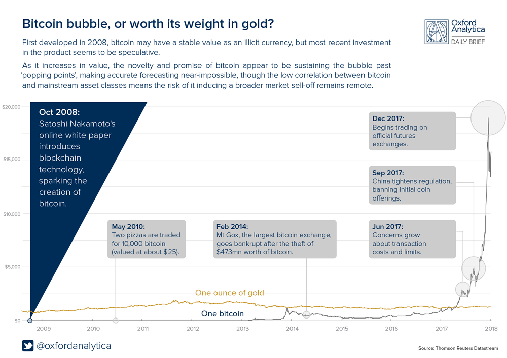
Context is also valuable for identifying patterns and trends the reader may not recognize immediately. If the substance of your content relies on the reader understanding the pattern depicted in one of your charts or graphs, you must point it out in the text. Otherwise, there is a chance they miss it entirely. Notice how this graph uses a title, paragraph text, and annotations to help the reader get more value from it.
In some cases, your audience may have the benefit of internal context. This term refers to knowledge and experiences your audience intuitively applies to your content. You don’t have to give them any additional context because they already have it.
For example, let’s say you share a graph of sales results with your sales team. The graph shows a spike in sales during May. Everyone on the sales team knows you offered a special promotion in May. The chart shows that the promotion was wildly successful. In this case, you don’t have to tell them why May was so successful; they already know. They have internal context.
In other cases, however, your audience won’t have the built-in context to understand your content. For instance, if you showed the same graph to one of your invited investors, they probably won’t know the details of your sales promotions. You would have to explain why the month of May was so much more successful than other months. This explanation process is called external context.
Relying on internal context is a mixed bag. On the one hand, it’s a waste of everyone’s time to explain concepts that the reader already understands. On the other hand, relying on internal context is always an assumption. What if the reader doesn’t know about what you’re talking? In this case, you are siloing information amongst people who already have it and diminishing the value of your content.
How to Add Context to Charts and Graphs
When it comes to adding contacts, simplicity is paramount. Your goal is to transfer information to the reader without adding too much fluff to your content. Here are some simple and effective ways to add context to your charts and graphs.
Titles and Subtitles
Titles and subtitles are the easiest ways to add context to charts. They can provide a lot of information for the reader if you craft them carefully.
Use titles to orient the reader to the chart. Be descriptive, but don’t try to be clever or witty. The reader should be able to read the title and immediately understand the chart’s purpose. You might find it helpful to title the chart with a question the reader would ask. Here are some examples of proper chart titles:
- Q3 Promotional Sales Figures
- Fundraising Totals by Month
- Post-onboarding Survey Results
- Do Our Employees Enjoy Their Benefits Packages?
With subtitles, you have a little more leeway. Subtitles are a great place to mention where you found the data, what it shows, or how it ties into the rest of your organization. For instance, for a chart titled “Post-onboarding Survey Results,” you might use a subtitle like this: “We surveyed 500 of our customers after onboarding to discover if the process was effective at helping them engage with the product.”
Annotations
An annotation on a chart or a graph is a simple marker that draws the reader’s eye. The purpose is to say, “This point is significant.” For instance, in this graph, they added an annotation to show the beginning of a campaign. This note helps the reader understand how the campaign affects the rest of the data.

Secondary Dimensions
Secondary dimensions are additional data points you add to your graph to give your readers a more granular view. They give your readers a complete view of the data.
Keep in mind, however, that putting two dimensions on a chart implies a relationship. In fact, many people will assume one data point causes the other. This shows why your secondary dimensions must relate closely to the first dimension on the graph (also called the primary dimension). Secondary dimensions are not tools to combine graphs to save space.
For instance, you could overlay your sales forecast on a graph of your sales results. This would help your readers judge how well sales stack up against your predictions. But it would be inappropriate to put sales results and everyone’s favorite ice cream flavor on the same graph (unless you can defend that relationship).
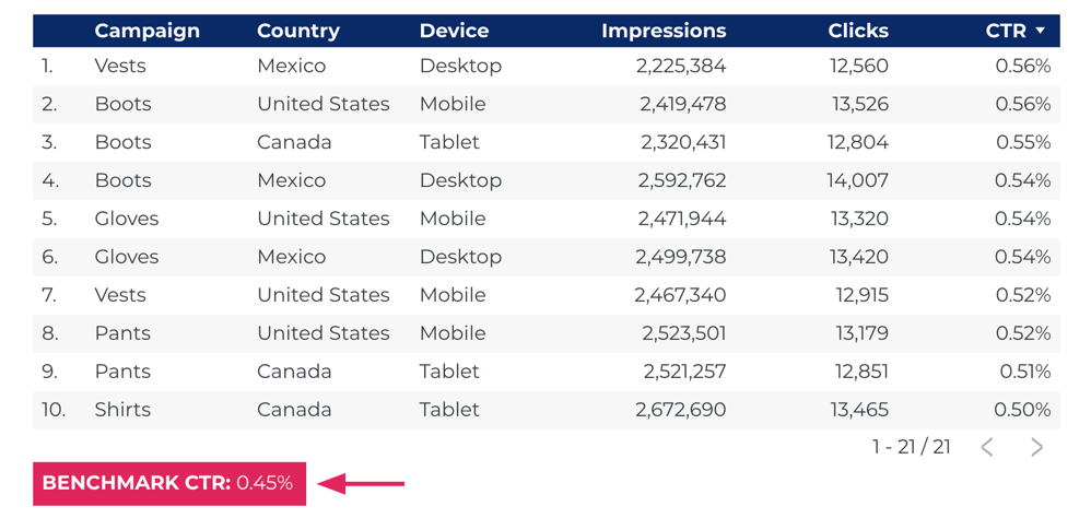
Benchmarks
When readers look at your data, someone will inevitably ask, “Is that good or bad?” This question arises when you lack enough context. Without a benchmark, they won’t understand whether or not your data is significant.
The simplest way to show benchmarks is to include a secondary dimension on your graph that offers a benchmark, as we explained in the previous tip. If you can’t add a secondary dimension to your graph, include another graph nearby. For instance, to benchmark a pie graph that shows your revenue sources, you could publish a pie graph of last year’s revenue sources alongside it.
If neither of those options work, simply add a text call-out somewhere that announces the benchmark you’re aiming for, like in this image:
Ratios and Hard Numbers
The format of your data impacts how people interpret it. If you use hard numbers, your readers may fail to see the impact of the change in those numbers. For instance, say your website traffic improves from 12,875 hits/month to 15,349 hits/month. Those numbers are hard to wrap our brains around, so it would be more impactful to tell your readers that traffic increased by 19%.
On the other hand, using ratios (percentages) can hide the truth behind your data, making it seem more impactful than it is. For instance, your leaders might be thrilled to learn that you increased your positive reviews by 400% this month but less enthused when they learn that your reviews only increased from two to eight.
So which should you use? You’ll have to make a judgment call. Choose the option that makes your data as accurate as possible. When in doubt, use both.
Cost/Price
In business, you’ll follow nearly every campaign, initiative, or investment with a critical question: “How much did it cost?” The results don’t really matter if the whole project costs more than its benefit to the organization. So you can give much-needed context by including the cost or price.
For instance, if you’re displaying a chart that shows the number of clicks you received from your latest ad campaign, there should definitely be a secondary dimension or in-text mention of the cost of those clicks. Give your readers a hard figure and the return on investment (ROI) percentage.
Paragraph Text
If you can’t figure out how to add context another way, your last resort is to add some paragraph text beneath your chart. Sometimes, this is the only reasonable way to make your point. Add a few sentences of copy that explains your chart, including anything you think will help the reader understand its meaning better.
That said, try to keep your paragraph text short and concise. If someone is trying to consume your content quickly, they aren’t going to read multiple dense paragraphs.
Going Forward
Keep in mind that your readers (whoever they are) are not as familiar with your data as you are. They need help to wrap their brains around the information. Giving them context gives them a fuller picture of the information you’re trying to present. Use the techniques we explained above to help them understand.