
Whether you’re a CEO, marketing coordinator, project manager, or sales executive, tracking data accurately and in real time is vital to making the right business decisions. Using data visualization to track metrics or measure the effectiveness of campaigns is an essential part of building and sustaining a successful organization.
GFChart’s Charting Against Time add-on combined with Gravity Forms is an easy-to-use solution for taking your raw form data and translating it into real-time, actionable charts and graphs.
In this article, we’ll show you how you can use GFChart’s new Charting Against Time add-on version 0.9 to analyze your data by day, week, and month.
What’s New in Charting vs Time Add-On v0.9?
The latest version of GFChart’s Charting vs Time add-on builds off of the success of the previous version while introducing more flexibility measuring real-time data. Share on XGFChart’s Charting vs Time Add-on was first released in January 2018 and has seen various new feature updates. The core benefit of the add-on is to allow WordPress users to plot their aggregated data over certain periods. In recent versions, charting of this data was limited to only being viewed by month.
Now, in the latest version of GFChart’s Charting vs Time Add-On, WordPress users utilizing Gravity Forms have the ability to chart their data by month, week, or even day. This added flexibility gives users better access to real-time data analytics and even more options to visualize their data.
How To Use Charting vs Time Add-On v0.9
Below, we’ll walk step-by-step through everything needed to start charting data by time and using all the great features of the new version of GFChart’s Charting vs Time Add-On v0.9.
Step 1: Install The Necessary Plugins
To utilize GFChart’s charting against time feature, you’ll need to ensure you have the necessary CMS and required plugins.
GFChart is designed as an add-on to Gravity Forms. In this case, you’ll need to be operating on the WordPress version 4.3 or higher and download both the Gravity Forms and GFChart Plugins.
Step 2: Create a New Form

Once logged in to your WordPress platform with both plugins installed, create a new Gravity Form by navigating to the left side panel, highlighting “Forms” and then selecting “New Form” in the dropdown list.
Gravity Forms is an incredibly flexible platform, and there are a variety of ways to structure your forms, so they pull in relevant data. For more information on setting up Gravity Form for your WordPress site, click here for step-by-step instructions.
Step 3: Select Your Charting Data
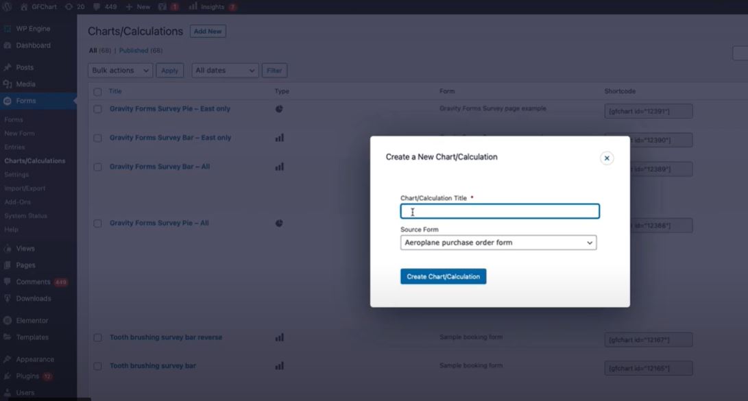
Once you have one or more forms created in Gravity Forms, you’re ready to move on to the next step – “Charts and Calculations.”
To do this, navigate to the left-side panel and once again highlight “Forms.” In the dropdown list, select “Charts/Calculations,” In the following screen, you can either select a previously created chart or create a new one by clicking “Add New.”
Step 4: Access GFChart Configuration
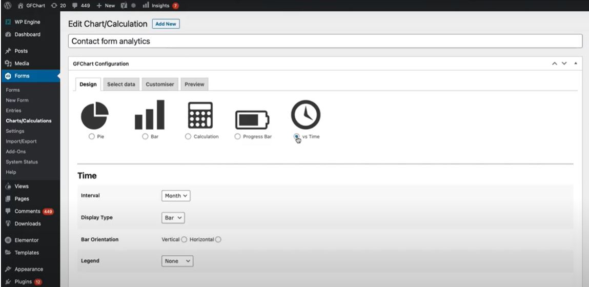
Once you have selected a previous form or created a new one and selected the source data, you will then access the GFChart Configuration module.
In the “Design” tab select the icon “vs Time“. After you’ve chosen this, the time charting criteria will then become available, and you’ll have the ability to format the data interval by day, week, or month as well as the chart type, orientation, and legend toggle.
After choosing your design settings, click “Select data” at the bottom right of your screen and you’ll be taken to the next set of options.
Step 5: Select Your Time Data Format
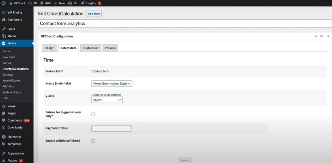
In the next tab “Select Data” you’ll be able to confirm your source data while also being able to choose your primary data variable used for charting.
In the “x-axis (main field)” dropdown list, choose the relevant date field you’ll want to use when charting against time.
If your charting data has numbers that require certain mathematical calculations, you can use the “y-axis” dropdown and select an appropriate calculation method.
Once finished, click “Customiser” on the bottom right of the screen.
Step 6: Customize Your Chart
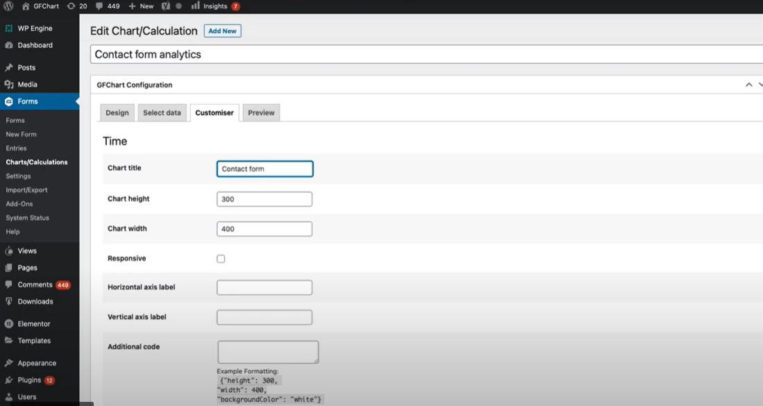
In the next tab “Customiser“, you’ll be able to give your newly charted data a title as well as customize the chart’s height, width, horizontal, and vertical axis labels.
Once you’ve customized the chart to your liking, click the “Preview” button on the bottom right of the screen.
Step 7: Preview and Edit Your Chart
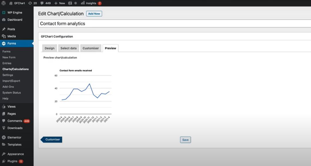
The “Preview” tab is where you can view the chart you’ve just created as well as make any necessary changes to the structural layout of the data visualization.
If you’d like to make changes to the layout, you can easily navigate between each different tab, make necessary changes, and navigate back to the “Preview” tab. Any changes, including switching between day, week, or year data frequencies, will seamlessly update in the preview tab and show you precisely what your chart will look like.
Get the Most Out of Your Form Data
The newly updated Charting vs Time Add-On for GFCharts gives organizations everything they need to create real-time charts and calculations from their form entries. Using an easy-to-configure interface and highly responsive design, GFCharts eliminates the headache of creating complex Excel charts and graphs and gives you everything you need to create highly actional reports all in one easy-to-use platform.
For more information on how to use GFChart’s Charting vs Time Add-On, click here.