
If you’re interested in building your own dashboard, you likely fall into one of two categories. You’re either an experienced and active planner who wants to observe live metrics of whatever data you have, or you’re overwhelmed with the information that you’ve gathered, and you need a better way to view it. Regardless of which position you’re in, don’t worry. A dashboard can help address both situations.
A dashboard using online forms turns into an essential business tool that tracks, analyzes, and displays data points, metrics, and key performance indicators from various sources. It allows you to take everything you have, put it into a single data visualization format, and track only the pieces of information you care about.
In this blog, we’ll discuss how you can build a dashboard using online forms. Let’s get started.
Step 1: Define What’s Important in Your Data
Before you do anything else, determine why you’re building a dashboard in the first place. Often, the answer can be derived from your data. Are you working with pre-existing data, or are you starting a form from scratch?
If you have pre-existing data, then you need to understand the limitations of the information you’re working with. Can the answer to your “problem” be found in the data you’re extracting? What were you trying to achieve, and what do you want to display in your dashboard? If you determine that you want to show a metric in your dashboard, but you don’t have the data for it, you may have to create a new form before moving forward.
If you’re creating a form from scratch, you need to figure out what information you care about and what problem you’re trying to solve. For example, if you want to know how close you are to completing a project, then you’d want to gather the correct data in your form to monitor project statuses in your dashboard.
This is a crucial step in the process because it clarifies your end goal and informs your dashboard’s design.
Step 2: Identify Who Will Be Viewing Your Dashboards
Dashboards will look different depending on who will be using them. You want to make sure that you create the right board for the right people. This will increase the likelihood that your board will be effective. Some questions you’ll need to ask include:
- What problems does this board need to solve? Remember, as noted in the step above, you’ll need to make sure you gather the correct data for this.
- What metrics are most important to the target group? What type of offering, business model (B2B, B2C), industry (e-commerce/SaaS), job function (product/marketing/sales), etc., is essential to your audience?
- What does the group stand to gain from this dashboard? What insight and clarity will the observers walk away with after looking at the board?
Step 3: Narrow Down Your Information
The goal of a dashboard is to display information and data clearly and concisely. As such, you want each user to have access to all the data they need, but no more and no less. Take time to narrow down the information you choose to include in your dashboard, and remember that everything included should support your board’s intent.
Ultimately, the point of your dashboard is to streamline the information you have and make it easier to read and understand. Here are some quick tips to help if you find that sorting through the data is becoming overwhelming.
- Follow the “5 Second Rule.” It should take only 5 seconds for any relevant stakeholder using the dashboard to locate the specific information they need.
- Round any numbers you’re using, if applicable. This prevents too much detail on your dashboard and improves data digestion. Having too much detail on your board can make minor changes seem significant.
- Label your metrics for your audience. Keep these labels short and self-explanatory for your audience to ensure they’re able to grasp the information at a glance.
Step 4: Utilize an Online Form
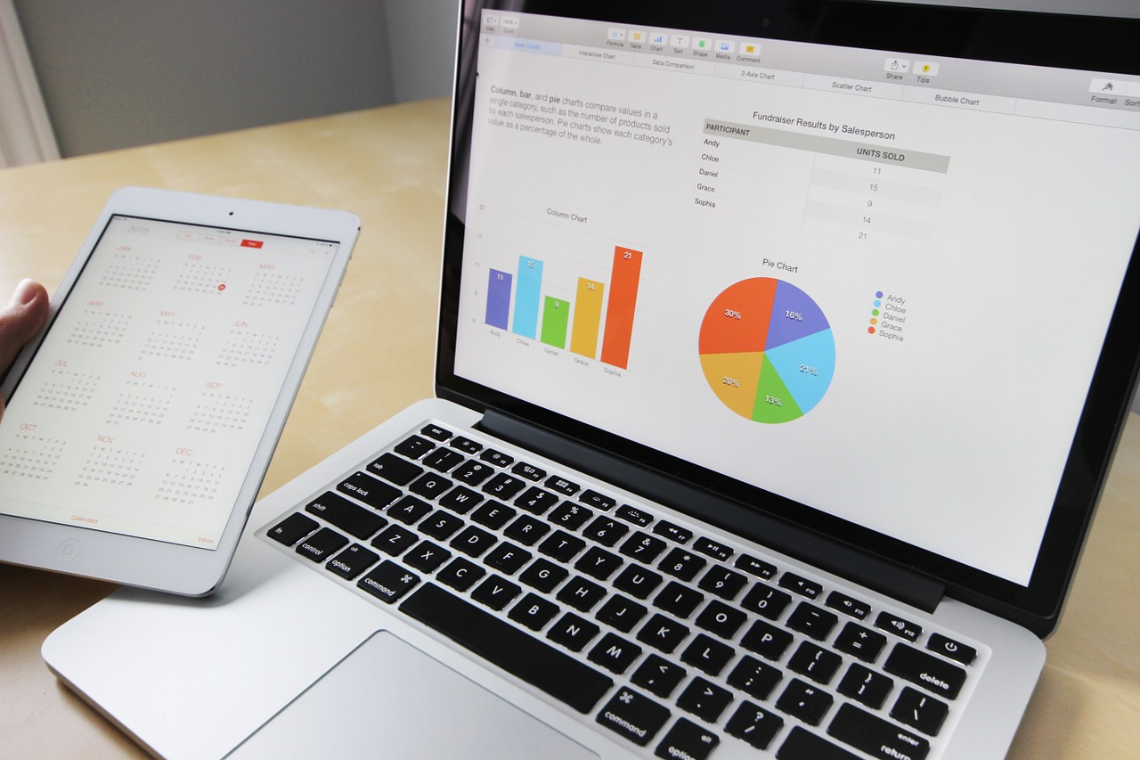
Online forms are a great way to extract useful information from your market while also giving you the data you need to build great functional dashboards. Share on XDo you want to make your information easy to understand and scan, but you’re not sure how? Utilizing Gravity Forms to gather relevant information paired with GFChart for data visualization is an excellent option for anyone who wants to turn data into knowledge and create charts and calculations from form entries.
Once you know what data is necessary and who needs to see it, you can create powerful and attractive dashboards and reports seamlessly. There’s no coding knowledge required, and if you need help, there’s a support team readily available to support you.
Step 5: Use an Intuitive Layout
Develop your dashboard in a way that’s easy to scan. There are a few key ways that you can create an intuitive layout.
- Structure content from left to right
- Pick a few colors to use on your board
- Choose one font per client
- Keep images to a minimum
- Use size and positioning within the board to make it clear what’s important
- Be consistent with visualizations and layout
Following these steps will ensure your information is easy to find and allow your viewer to compare related metrics without confusion.
Step 6: Keep Your Dashboard Relevant
You want your dashboard to remain functional and relevant. Once you’ve created it, ask your team for feedback. Here are some questions to consider:
- What does my audience use most often? What do they find most useful and why?
- What data metrics might distract from your intended message? What information does your audience find least helpful? Why?
- Is there anything missing from your dashboard that could be visualized using your current data?
- How will the metrics shown in your dashboard impact your audience’s day-to-day activities?
Once you’ve gathered this feedback, implement those changes and consider what impact they’ve had. Continue to check that your dashboard is encouraging the correct behavior.
Final Thoughts
Using a dashboard allows you to measure and track essential components of data in real time. Whether you or your stakeholders want to observe live metrics of the market or customer data, a dashboard will allow you to do this quickly and easily.
GFChart provides an easy-to-use solution for data visualization that pairs well with online form data. It streamlines the entire process of graphing and charting your data and allows you to create a helpful dashboard that’s easy to understand and update.
Are you ready to get started? Visit GFChart to learn more.