Time: 3-5 mins for one question. Clone others in seconds.
Ingredients: Gravity Forms, GFChart (BASIC)
Step 1
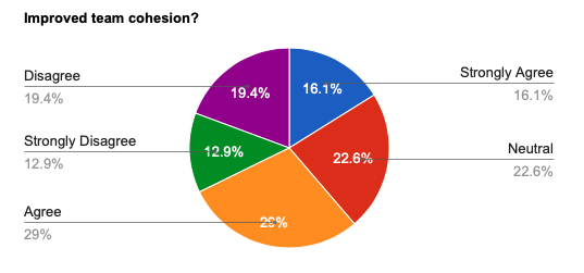
This chart is made using the results from forms using Gravity Forms standard radio buttons.
Ensure that your survey has been created within Gravity Forms and there are entries.
Step 2
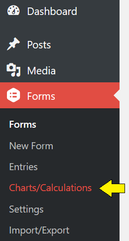
Go to the ‘Forms’ tab on the WordPress dashboard.
Once the GFChart plugin has been installed and activated, click on the sub-tab titled ‘Charts/Calculations’.
Step 3
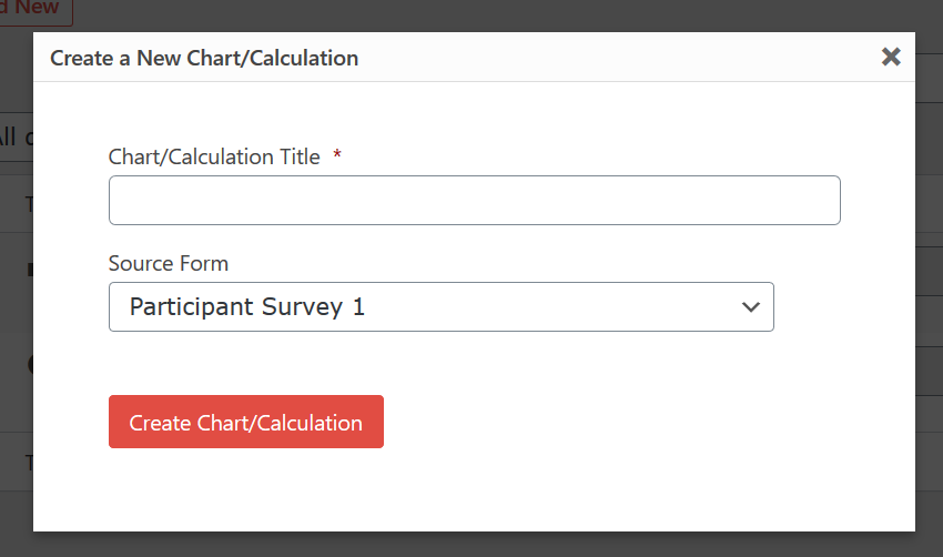
Click ‘Add New’.
In the pop-up box under ‘Chart/Calculation Title’ create the title of your chart.
In ‘Source Form’ use the drop down box to select which Gravity Form you would like to use to create your chart.
Step 4
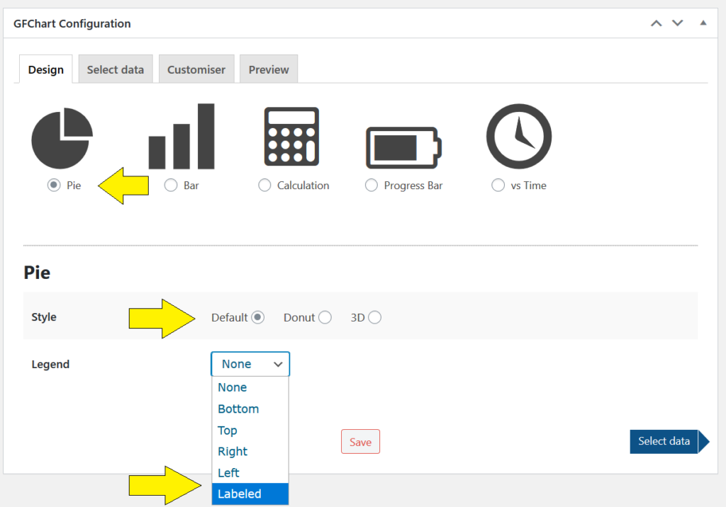
Under GFChart Configuration click ‘Pie’.
Further design options will appear giving you choice of style and where you’d like to include your legend.
In this example we’ve selected the default style and have each pie segment labelled.
Press ‘Select data’
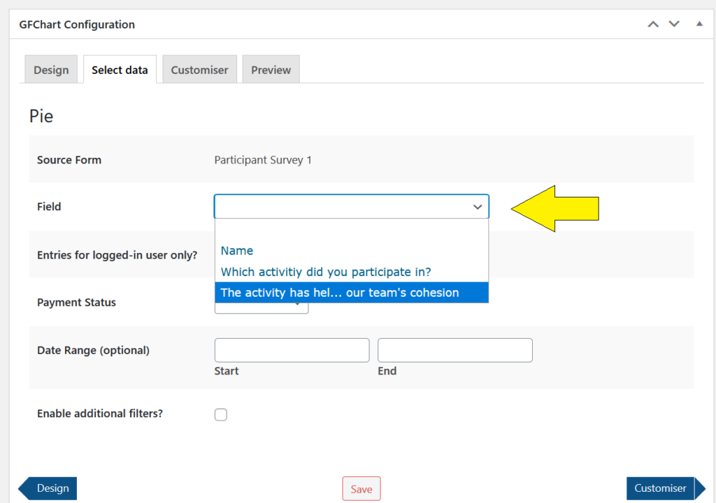
Step 5
The ‘Select Data’ tab will enable you to choose what data to be presented in your chart.
Use the drop-down menu under ‘Field’ to select the field from your Gravity Form survey you wish to chart. In this case, chose the field with the radio button questions.
Press ‘Customiser’.
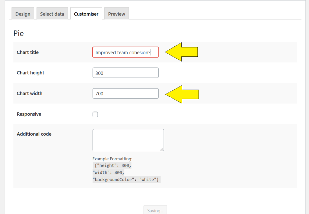
Step 6
Under the ‘Customiser’ tab you will be able to insert the title you wish to be presented with your chart.
You can also adjust the chart height and width. Default settings have a height of 300 and a width of 400 pixels.
When using a labelled pie chart the width needs to be increased in order to see the segment labels clearly. In this example we have extended it to 700.
Press on ‘Preview’.
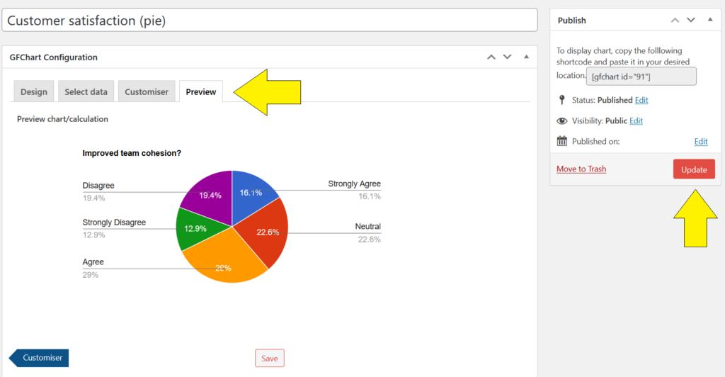
Step 7
Under the ‘Preview’ tab you will be able to see what your chart looks like. You can click back through the other tabs to continue adjusting the chart settings and then come back to preview the affect of any changes.
Once you are satisfied with your chart. Click the red ‘Update’ button within the box labelled ‘Publish’ to the left of the screen.
Note that the ‘Publish’ box also includes the shortcode for this chart.
Publish the chart by pasting this shortode onto a post, page or widget. Alternatively publish using the block described below.
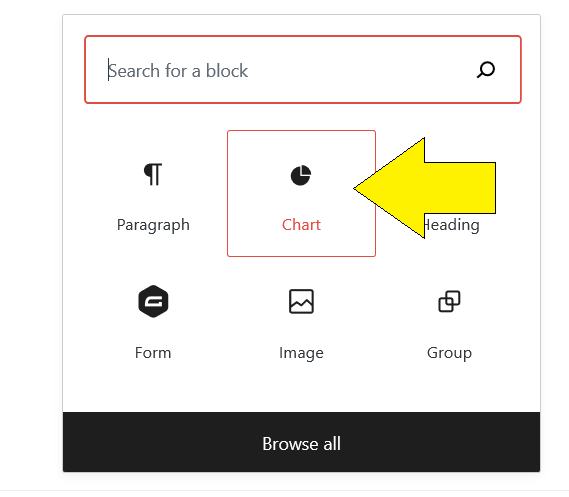
Step 8
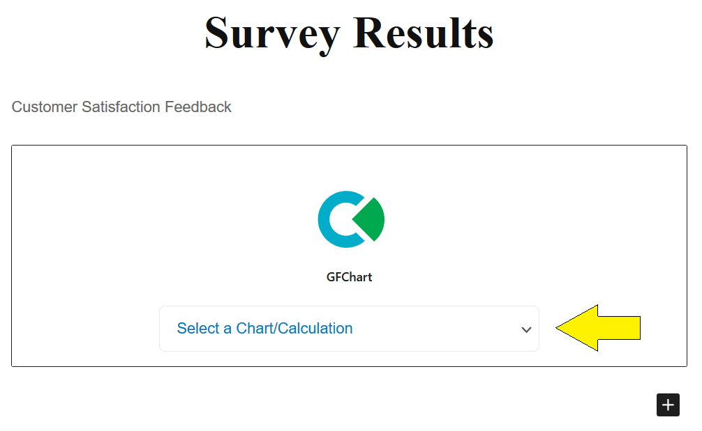
To add your chart to a WordPress page, add a new block and select ‘Chart’.
Step 9
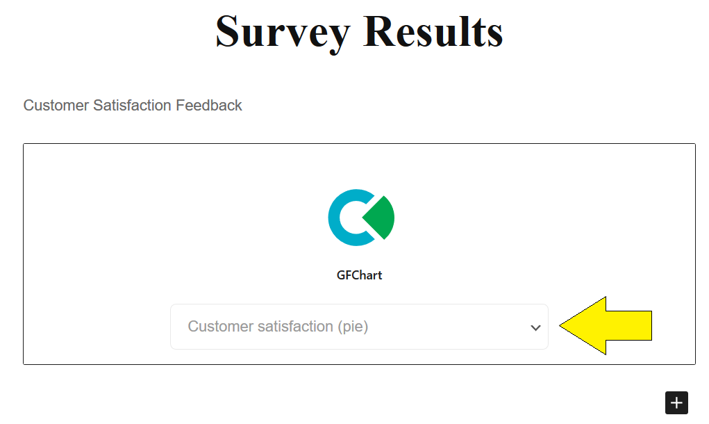
Once the block is added you can use the drop-down box to select the chart you’d like to include on the page.
Step 10
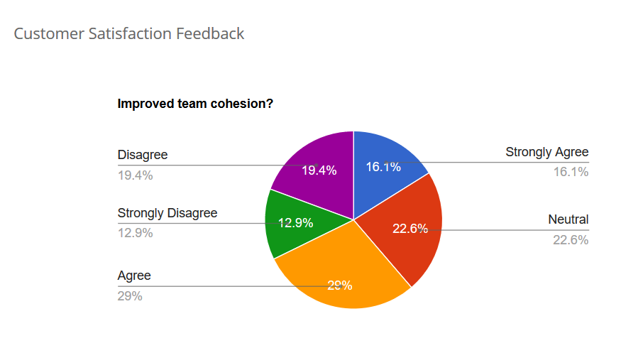
Once your chart has been added to the page, it will be displayed as illustrated in the WordPress page editor.
The only distinguishing feature will be the chart title.
Step 11
When the page is previewed or published your selected chart will be visible.
Mix it up:
Quickly repeat for other questions using ‘Clone’ button then select a different field under ‘Select data’.