
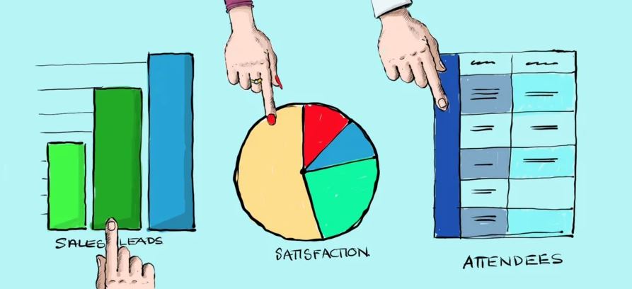
If you collect data from customer enquiry forms, surveys, booking requests, or quizzes, then you’ll understand that the data alone can be difficult to interpret until you see it in graphs and charts.
Until then, that data is just numbers and words on a page or spreadsheet. You need to be able to convert that myriad of data into engaging, colourful, visual, digestible information to get your point across.
Using WordPress Gravity Forms, that task is made quite simple. With the right Plugin, your data can come to life in the form of colourful charts and graphs explaining what works, what’s good, and even what isn’t working.
Your data can be presented as engaging event booking charts, survey reports, KPI dashboards, even data visualisation, diagnostic pie charts, defect reports in the form of interactive bar charts, sales report charts and more.
Benefits of making WordPress graphs and charts using a plugin.
It’s not unheard of to create a chart in Excel and then screenshot it and paste into your website or blog post as an image. This can work, but often it’s a waste of time. Particularly when you can get these benefits with a plugin. Using a WordPress plugin, like GFChart for Gravity Forms for instance, simplifies the chart or graph building process.
- Your graph building is consolidated into the one area, so everything you produce can look and feel the same.
- It saves you a heap of time.
- Your Chart is always up to date, because it always uses live data. It’s like a live scoreboard at a sports match.
- Colours can be edited to match the palette of your site, or to the meaning of the response.
- You can also easily re-order your data to ensure your data is displayed in the most logical order.
- If you are using interactive features they will update and view as required, something you just won’t get from a screenshot image.
Do More Than Just Create Tables
All WordPress charts and graphs have their own different functions, therfore it’s a case of what you need and what suits your own use-case. GFChart gives you ultimate functionality to produce dynamic charts and graphs where the information changes as it is updated.
There is a great range of capabilities to be utilised by using GFChart. Here are a few great functionality features:
- Chart from multiple entries as shown in GravityView, including its front-end filtering function.
- Build a WordPress Assessment Quiz. These are commonly used for personality style assessments. See working example here.
- Charting vs Time
- Create Sales reports
- Charting and Calculations within emails and PDF’s.
- Survey Customising which allows users to modify a chart Bar or Segment for Colour Matching, and Ordering of the displayed results.
Conclusion
It’s difficult for most people to get a grasp of your data when its presented in Plain Text or Tabular format, and if they don’t engage, they will move on. By using charts and graphs, it’s an easy way to ensure they do engage in your important data. Using easily digestible formats will get your information noticed and acted on.
LEARN MORE about GFChart at www.gfchart.com
#wordpress #gravityforms #gfchart #salesreports #marketing #surveys #data #events