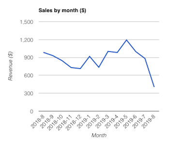
There is no better way to display a sales trend than a line chart. Line Charts are used to track changes over short and long periods of time. When smaller changes exist, line charts are better to use than bar graphs. Line charts can also be used to compare changes over the same period of time for more than one group.

Line Charts are now available as a GFChart premium feature in the Charting vs Time add-on (v0.5).
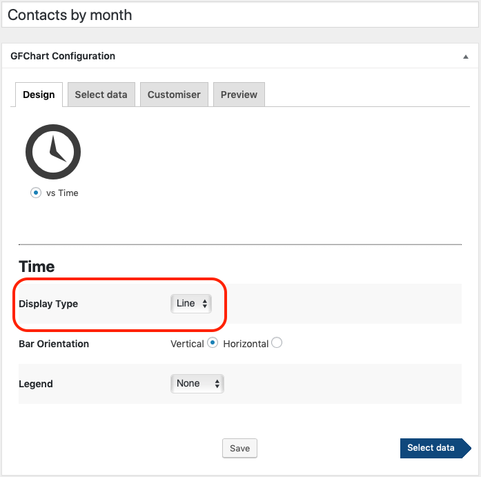
We’ve made configuration super simple via a new ‘display type’ drop down box.

Don’t want to miss out on updates as they come out?
We agree, you shouldn’t miss out. You’ve been using GFChart for a while now so maybe it’s time to upgrade to the ‘ALL’ package so you get access to new updates as they are released. Upgrade instructions are here for existing ‘Classic’ and ‘Plus’ customers.
If you are already an ‘ALL’ package customer, then you can jump right onto your plugin dashboard and update to “Charting vs Time” via a 1-click update button.
Don’t have GFChart yet?
Here is a nice big button to make it easy for you.
